Built-in Widgets
AGroupBox
- class libqtile.widget.AGroupBox(*args, **kwargs)[source]
A widget that graphically displays the current group
Supported bar orientations: horizontal only
Configuration options
key
default
description
backgroundNoneWidget background color
border'000000'group box border color
borderwidth3Current group border width
center_alignedTruecenter-aligned group box
fmt'{}'Format to apply to the string returned by the widget. Main purpose: applying markup. For a widget that returns
foo, usingfmt='<i>{}</i>'would give you<i>foo</i>. To control what the widget outputs in the first place, use theformatparamater of the widget (if it has one).font'sans'Default font
fontshadowNonefont shadow color, default is None(no shadow)
fontsizeNoneFont size. Calculated if None.
foreground'ffffff'Foreground colour
margin3Margin inside the box
margin_xNoneX Margin. Overrides 'margin' if set
margin_yNoneY Margin. Overrides 'margin' if set
markupFalseWhether or not to use pango markup
max_chars0Maximum number of characters to display in widget.
mouse_callbacks{}Dict of mouse button press callback functions. Accepts functions and
lazycalls.paddingNonePadding. Calculated if None.
padding_xNoneX Padding. Overrides 'padding' if set
padding_yNoneY Padding. Overrides 'padding' if set
scrollFalseWhether text should be scrolled. When True, you must set the widget's
width.scroll_clearFalseWhether text should scroll completely away (True) or stop when the end of the text is shown (False)
scroll_delay2Number of seconds to pause before starting scrolling and restarting/clearing text at end
scroll_fixed_widthFalseWhen
scroll=Truethewidthparameter is a maximum width and, when text is shorter than this, the widget will resize. Settingscroll_fixed_width=Truewill force the widget to have a fixed width, regardless of the size of the text.scroll_hideFalseWhether the widget should hide when scrolling has finished
scroll_interval0.1Time in seconds before next scrolling step
scroll_repeatTrueWhether text should restart scrolling once the text has ended
scroll_step1Number of pixels to scroll with each step
Available commands
Click to view the available commands for
AGroupBox
Backlight
- class libqtile.widget.Backlight(*args, **kwargs)[source]
A simple widget to show the current brightness of a monitor.
If the change_command parameter is set to None, the widget will attempt to use the interface at /sys/class to change brightness. This depends on having the correct udev rules, so be sure Qtile's udev rules are installed correctly.
You can also bind keyboard shortcuts to the backlight widget with:
from libqtile.widget import backlight
Key(
    [],
    "XF86MonBrightnessUp",
    lazy.widget['backlight'].change_backlight(backlight.ChangeDirection.UP)
)
Key(
    [],
    "XF86MonBrightnessDown",
    lazy.widget['backlight'].change_backlight(backlight.ChangeDirection.DOWN)
)
Supported bar orientations: horizontal and vertical
Configuration options
key
default
description
backgroundNoneWidget background color
backlight_name'acpi_video0'ACPI name of a backlight device
brightness_file'brightness'Name of file with the current brightness in /sys/class/backlight/backlight_name
change_command'xbacklight -set {0}'Execute command to change value
fmt'{}'Format to apply to the string returned by the widget. Main purpose: applying markup. For a widget that returns
foo, usingfmt='<i>{}</i>'would give you<i>foo</i>. To control what the widget outputs in the first place, use theformatparamater of the widget (if it has one).font'sans'Default font
fontshadowNonefont shadow color, default is None(no shadow)
fontsizeNoneFont size. Calculated if None.
foreground'ffffff'Foreground colour
format'{percent:2.0%}'Display format
markupTrueWhether or not to use pango markup
max_brightness_file'max_brightness'Name of file with the maximum brightness in /sys/class/backlight/backlight_name
max_chars0Maximum number of characters to display in widget.
min_brightness0Minimum brightness percentage
mouse_callbacks{}Dict of mouse button press callback functions. Accepts functions and
lazycalls.paddingNonePadding. Calculated if None.
scrollFalseWhether text should be scrolled. When True, you must set the widget's
width.scroll_clearFalseWhether text should scroll completely away (True) or stop when the end of the text is shown (False)
scroll_delay2Number of seconds to pause before starting scrolling and restarting/clearing text at end
scroll_fixed_widthFalseWhen
scroll=Truethewidthparameter is a maximum width and, when text is shorter than this, the widget will resize. Settingscroll_fixed_width=Truewill force the widget to have a fixed width, regardless of the size of the text.scroll_hideFalseWhether the widget should hide when scrolling has finished
scroll_interval0.1Time in seconds before next scrolling step
scroll_repeatTrueWhether text should restart scrolling once the text has ended
scroll_step1Number of pixels to scroll with each step
step10Percent of backlight every scroll changed
update_interval0.2The delay in seconds between updates
Available commands
Click to view the available commands for
Backlight
Battery
- class libqtile.widget.Battery(*args, **kwargs)[source]
A text-based battery monitoring widget supporting both Linux and FreeBSD.
The Linux version of this widget has functionality to charge "smartly" (i.e. not to 100%) under user defined conditions, and provides some implementations for doing so. For example, to only charge the battery to 90%, use:
Battery(..., charge_controller: lambda (0, 90))
The battery widget also supplies some charging algorithms. To only charge the battery between 40-50% while connected to a thunderbolt docking station, but 90% all other times, use:
from libqtile.widget.battery import thunderbolt_smart_charge
Battery(..., charge_controller: thunderbolt_smart_charge)
To temporarily disable/re-enable this (e.g. if you know you're going mobile and need to charge) use either:
qtile cmd-obj -o bar top widget battery -f charge_to_full
qtile cmd-obj -o bar top widget battery -f charge_dynamically
or bind a key to:
Key([mod, "shift"], "c", lazy.widget['battery'].charge_to_full())
Key([mod, "shift"], "x", lazy.widget['battery'].charge_dynamically())
note that this functionality requires qtile to be able to write to certain files in sysfs, so make sure that qtile's udev rules are installed correctly.
Supported bar orientations: horizontal and vertical
example config 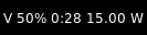
default Configuration options
key
default
description
backgroundNoneWidget background color
battery0Which battery should be monitored (battery number or name)
charge_char'^'Character to indicate the battery is charging
discharge_char'V'Character to indicate the battery is discharging
empty_char'x'Character to indicate the battery is empty
fmt'{}'Format to apply to the string returned by the widget. Main purpose: applying markup. For a widget that returns
foo, usingfmt='<i>{}</i>'would give you<i>foo</i>. To control what the widget outputs in the first place, use theformatparamater of the widget (if it has one).font'sans'Default font
fontshadowNonefont shadow color, default is None(no shadow)
fontsizeNoneFont size. Calculated if None.
foreground'ffffff'Foreground colour
format'{char} {percent:2.0%} {hour:d}:{min:02d} {watt:.2f} W'Display format
full_char'='Character to indicate the battery is full
hide_thresholdNoneHide the text when there is enough energy 0 <= x < 1
low_backgroundNoneBackground color on low battery
low_foreground'FF0000'Font color on low battery
low_percentage0.1Indicates when to use the low_foreground color 0 < x < 1
markupTrueWhether or not to use pango markup
max_chars0Maximum number of characters to display in widget.
mouse_callbacks{}Dict of mouse button press callback functions. Accepts functions and
lazycalls.not_charging_char'*'Character to indicate the batter is not charging
notification_timeout10Time in seconds to display notification. 0 for no expiry.
notify_belowNoneSend a notification below this battery level.
paddingNonePadding. Calculated if None.
scrollFalseWhether text should be scrolled. When True, you must set the widget's
width.scroll_clearFalseWhether text should scroll completely away (True) or stop when the end of the text is shown (False)
scroll_delay2Number of seconds to pause before starting scrolling and restarting/clearing text at end
scroll_fixed_widthFalseWhen
scroll=Truethewidthparameter is a maximum width and, when text is shorter than this, the widget will resize. Settingscroll_fixed_width=Truewill force the widget to have a fixed width, regardless of the size of the text.scroll_hideFalseWhether the widget should hide when scrolling has finished
scroll_interval0.1Time in seconds before next scrolling step
scroll_repeatTrueWhether text should restart scrolling once the text has ended
scroll_step1Number of pixels to scroll with each step
show_short_textTrueShow "Full" or "Empty" rather than formated text
unknown_char'?'Character to indicate the battery status is unknown
update_interval60Seconds between status updates
Available commands
Click to view the available commands for
Battery
BatteryIcon
- class libqtile.widget.BatteryIcon(*args, **kwargs)[source]
Battery life indicator widget.
Supported bar orientations: horizontal only
example config 
default Configuration options
key
default
description
backgroundNoneWidget background color
battery0Which battery should be monitored
mouse_callbacks{}Dict of mouse button press callback functions. Accepts functions and
lazycalls.padding0Additional padding either side of the icon
scale1Scale factor relative to the bar height. Defaults to 1
theme_path'/home/docs/checkouts/readthedocs.org/user_builds/qtile/checkouts/latest/libqtile/resources/battery-icons'Path of the icons
update_interval60Seconds between status updates
Available commands
Click to view the available commands for
BatteryIcon
Bluetooth
- class libqtile.widget.Bluetooth(*args, **kwargs)[source]
Bluetooth widget that provides following functionality: - View multiple adapters/devices (adapters can be filtered) - Set power and discovery status for adapters - Connect/disconnect/pair devices
The widget works by providing a menu in the bar. Different items are accessed by scrolling up and down on the widget.
Clicking on an adapter will open a submenu allowing you to set power and discovery status.
Clicking on a device will perform an action based on the status of that device: - Connected devices will be disconnected - Disconnected devices will be connected - Unpaired devices (which appear if discovery is on) will be paired and connected
Symbols are used to show the status of adapters and devices.
Battery level for bluetooth devices can also be shown if available. This functionality is not available by default on all distros. If it doesn't work, you can try adding
Experimental = trueto/etc/bluetooth/main.conf.Supported bar orientations: horizontal and vertical
example config 
default 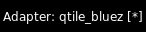
default 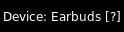
default 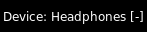
default 
default Configuration options
key
default
description
adapter_format'Adapter: {name} [{powered}{discovery}]'Text to display when showing adapter device.
adapter_paths[]List of DBus object path for bluetooth adapter (e.g. '/org/bluez/hci0'). Empty list will show all adapters.
backgroundNoneWidget background color
default_show_batteryFalseInclude battery level of 'connected_devices' in 'default_text'. Uses 'device_battery_format'.
default_text'BT {connected_devices}'Text to show when not scrolling through menu. Available fields: 'connected_devices' list of connected devices, 'num_connected_devices' number of connected devices, 'adapters' list of bluetooth adapters, 'num_adapters' number of bluetooth adapters.
default_timeoutNoneTime before reverting to default_text. If 'None', text will stay on selected item.
deviceNoneDevice path, can be found with d-feet or similar dbus explorer. When set, the widget will default to showing this device status.
device_battery_format' ({battery}%)'Text to be shown if device reports battery level
device_format'Device: {name}{battery_level} [{symbol}]'Text to display when showing bluetooth device. The
{adapterfield is also available if you're using multiple adapters.fmt'{}'Format to apply to the string returned by the widget. Main purpose: applying markup. For a widget that returns
foo, usingfmt='<i>{}</i>'would give you<i>foo</i>. To control what the widget outputs in the first place, use theformatparamater of the widget (if it has one).font'sans'Default font
fontshadowNonefont shadow color, default is None(no shadow)
fontsizeNoneFont size. Calculated if None.
foreground'ffffff'Foreground colour
hciNone(deprecated) same as 'device'.
hide_unnamed_devicesFalseDevices with no name will be hidden from scan results
margin3Margin inside the box
margin_xNoneX Margin. Overrides 'margin' if set
margin_yNoneY Margin. Overrides 'margin' if set
markupTrueWhether or not to use pango markup
max_chars0Maximum number of characters to display in widget.
mouse_callbacks{}Dict of mouse button press callback functions. Accepts functions and
lazycalls.paddingNonePadding. Calculated if None.
scrollFalseWhether text should be scrolled. When True, you must set the widget's
width.scroll_clearFalseWhether text should scroll completely away (True) or stop when the end of the text is shown (False)
scroll_delay2Number of seconds to pause before starting scrolling and restarting/clearing text at end
scroll_fixed_widthFalseWhen
scroll=Truethewidthparameter is a maximum width and, when text is shorter than this, the widget will resize. Settingscroll_fixed_width=Truewill force the widget to have a fixed width, regardless of the size of the text.scroll_hideFalseWhether the widget should hide when scrolling has finished
scroll_interval0.1Time in seconds before next scrolling step
scroll_repeatTrueWhether text should restart scrolling once the text has ended
scroll_step1Number of pixels to scroll with each step
separator', 'Separator for lists in 'default_text'.
symbol_connected'*'Symbol to indicate device is connected
symbol_discovery('D', '')Symbols when adapter is discovering and not discovering
symbol_paired'-'Symbol to indicate device is paired but unconnected
symbol_powered('*', '-')Symbols when adapter is powered and unpowered.
symbol_unknown'?'Symbol to indicate device is unpaired
Available commands
Click to view the available commands for
Bluetooth
CPU
- class libqtile.widget.CPU(*args, **kwargs)[source]
A simple widget to display CPU load and frequency.
Widget requirements: psutil.
Supported bar orientations: horizontal and vertical
example config 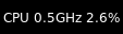
default Configuration options
key
default
description
backgroundNoneWidget background color
fmt'{}'Format to apply to the string returned by the widget. Main purpose: applying markup. For a widget that returns
foo, usingfmt='<i>{}</i>'would give you<i>foo</i>. To control what the widget outputs in the first place, use theformatparamater of the widget (if it has one).font'sans'Default font
fontshadowNonefont shadow color, default is None(no shadow)
fontsizeNoneFont size. Calculated if None.
foreground'ffffff'Foreground colour
format'CPU {freq_current}GHz {load_percent}%'CPU display format
markupTrueWhether or not to use pango markup
max_chars0Maximum number of characters to display in widget.
mouse_callbacks{}Dict of mouse button press callback functions. Accepts functions and
lazycalls.paddingNonePadding. Calculated if None.
scrollFalseWhether text should be scrolled. When True, you must set the widget's
width.scroll_clearFalseWhether text should scroll completely away (True) or stop when the end of the text is shown (False)
scroll_delay2Number of seconds to pause before starting scrolling and restarting/clearing text at end
scroll_fixed_widthFalseWhen
scroll=Truethewidthparameter is a maximum width and, when text is shorter than this, the widget will resize. Settingscroll_fixed_width=Truewill force the widget to have a fixed width, regardless of the size of the text.scroll_hideFalseWhether the widget should hide when scrolling has finished
scroll_interval0.1Time in seconds before next scrolling step
scroll_repeatTrueWhether text should restart scrolling once the text has ended
scroll_step1Number of pixels to scroll with each step
update_interval1.0Update interval for the CPU widget
Available commands
Click to view the available commands for
CPU
CPUGraph
- class libqtile.widget.CPUGraph(*args, **kwargs)[source]
Display CPU usage graph.
Widget requirements: psutil.
Supported bar orientations: horizontal only
example config 
default 
type='box'
type='line'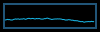
type='line', line_width=1
start_pos='top'Configuration options
key
default
description
backgroundNoneWidget background color
border_color'215578'Widget border color
border_width2Widget border width
core'all'Which core to show (all/0/1/2/...)
fill_color'1667EB.3'Fill color for linefill graph
frequency1Update frequency in seconds
graph_color'18BAEB'Graph color
line_width3Line width
margin_x3Margin X
margin_y3Margin Y
mouse_callbacks{}Dict of mouse button press callback functions. Accepts functions and
lazycalls.samples100Count of graph samples.
start_pos'bottom'Drawer starting position ('bottom'/'top')
type'linefill''box', 'line', 'linefill'
Available commands
Click to view the available commands for
CPUGraph
Canto
- class libqtile.widget.Canto(*args, **kwargs)[source]
Display RSS feeds updates using the canto console reader
Widget requirements: canto
Supported bar orientations: horizontal and vertical
Configuration options
key
default
description
all_format'{number}'All feeds display format
backgroundNoneWidget background color
feeds[]List of feeds to display, empty for all
fetchFalseWhether to fetch new items on update
fmt'{}'Format to apply to the string returned by the widget. Main purpose: applying markup. For a widget that returns
foo, usingfmt='<i>{}</i>'would give you<i>foo</i>. To control what the widget outputs in the first place, use theformatparamater of the widget (if it has one).font'sans'Default font
fontshadowNonefont shadow color, default is None(no shadow)
fontsizeNoneFont size. Calculated if None.
foreground'ffffff'Foreground colour
markupTrueWhether or not to use pango markup
max_chars0Maximum number of characters to display in widget.
mouse_callbacks{}Dict of mouse button press callback functions. Accepts functions and
lazycalls.one_format'{name}: {number}'One feed display format
paddingNonePadding. Calculated if None.
scrollFalseWhether text should be scrolled. When True, you must set the widget's
width.scroll_clearFalseWhether text should scroll completely away (True) or stop when the end of the text is shown (False)
scroll_delay2Number of seconds to pause before starting scrolling and restarting/clearing text at end
scroll_fixed_widthFalseWhen
scroll=Truethewidthparameter is a maximum width and, when text is shorter than this, the widget will resize. Settingscroll_fixed_width=Truewill force the widget to have a fixed width, regardless of the size of the text.scroll_hideFalseWhether the widget should hide when scrolling has finished
scroll_interval0.1Time in seconds before next scrolling step
scroll_repeatTrueWhether text should restart scrolling once the text has ended
scroll_step1Number of pixels to scroll with each step
update_interval600Update interval in seconds, if none, the widget updates only once.
Available commands
Click to view the available commands for
Canto
CapsNumLockIndicator
- class libqtile.widget.CapsNumLockIndicator(*args, **kwargs)[source]
Really simple widget to show the current Caps/Num Lock state.
Supported bar orientations: horizontal and vertical
example config 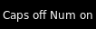
default Configuration options
key
default
description
backgroundNoneWidget background color
fmt'{}'Format to apply to the string returned by the widget. Main purpose: applying markup. For a widget that returns
foo, usingfmt='<i>{}</i>'would give you<i>foo</i>. To control what the widget outputs in the first place, use theformatparamater of the widget (if it has one).font'sans'Default font
fontshadowNonefont shadow color, default is None(no shadow)
fontsizeNoneFont size. Calculated if None.
foreground'ffffff'Foreground colour
markupTrueWhether or not to use pango markup
max_chars0Maximum number of characters to display in widget.
mouse_callbacks{}Dict of mouse button press callback functions. Accepts functions and
lazycalls.paddingNonePadding. Calculated if None.
scrollFalseWhether text should be scrolled. When True, you must set the widget's
width.scroll_clearFalseWhether text should scroll completely away (True) or stop when the end of the text is shown (False)
scroll_delay2Number of seconds to pause before starting scrolling and restarting/clearing text at end
scroll_fixed_widthFalseWhen
scroll=Truethewidthparameter is a maximum width and, when text is shorter than this, the widget will resize. Settingscroll_fixed_width=Truewill force the widget to have a fixed width, regardless of the size of the text.scroll_hideFalseWhether the widget should hide when scrolling has finished
scroll_interval0.1Time in seconds before next scrolling step
scroll_repeatTrueWhether text should restart scrolling once the text has ended
scroll_step1Number of pixels to scroll with each step
update_interval0.5Update Time in seconds.
Available commands
Click to view the available commands for
CapsNumLockIndicator
CheckUpdates
- class libqtile.widget.CheckUpdates(*args, **kwargs)[source]
Shows number of pending updates in different unix systems.
The following built-in options are available via the
distroparameter:'Arch'runs('pacman -Qu', 0)'Arch_checkupdates'runs('checkupdates', 0)'Arch_Sup'runs('pacman -Sup', 0)'Arch_paru'runs('paru -Qu', 0)'Arch_paru_Sup'runs('paru -Sup', 0)'Arch_yay'runs('yay -Qu', 0)'Debian'runs('apt-show-versions -u -b', 0)'Gentoo_eix'runs('EIX_LIMIT=0 eix -u# --world', 0)'Guix'runs('guix upgrade --dry-run', 0)'Ubuntu'runs('aptitude search ~U', 0)'Fedora'runs('dnf list updates -q', 1)'FreeBSD'runs("pkg_version -I -l '<'", 0)'Mandriva'runs('urpmq --auto-select', 0)'Void'runs('xbps-install -nuMS', 0)
Note
It is common for package managers to return a non-zero code when there are no updates. As a result, the widget will treat any error as if there are no updates. If you are using a custom commmand/script, you should therefore ensure that it returns zero when it completes if you wish to see the output of your command.
In addition, as no errors are recorded to the log, if the widget is showing no updates and you believe that to be incorrect, you should run the appropriate command in a terminal to view any error messages.
Supported bar orientations: horizontal and vertical
example config 
no_update_string='No updates'
no_update_string='No updates'Configuration options
key
default
description
backgroundNoneWidget background color
colour_have_updates'ffffff'Colour when there are updates.
colour_no_updates'ffffff'Colour when there's no updates.
custom_commandNoneCustom shell command for checking updates (counts the lines of the output)
custom_command_modify<function CheckUpdates.<lambda> at 0x7fa5f8233130>Lambda function to modify line count from custom_command
display_format'Updates: {updates}'Display format if updates available
distro'Arch'Name of your distribution
executeNoneCommand to execute on click
fmt'{}'Format to apply to the string returned by the widget. Main purpose: applying markup. For a widget that returns
foo, usingfmt='<i>{}</i>'would give you<i>foo</i>. To control what the widget outputs in the first place, use theformatparamater of the widget (if it has one).font'sans'Default font
fontshadowNonefont shadow color, default is None(no shadow)
fontsizeNoneFont size. Calculated if None.
foreground'ffffff'Foreground colour
initial_text''Draw the widget immediately with an initial text, useful if it takes time to check system updates.
markupTrueWhether or not to use pango markup
max_chars0Maximum number of characters to display in widget.
mouse_callbacks{}Dict of mouse button press callback functions. Accepts functions and
lazycalls.no_update_string''String to display if no updates available
paddingNonePadding. Calculated if None.
restart_indicator''Indicator to represent reboot is required. (Ubuntu only)
scrollFalseWhether text should be scrolled. When True, you must set the widget's
width.scroll_clearFalseWhether text should scroll completely away (True) or stop when the end of the text is shown (False)
scroll_delay2Number of seconds to pause before starting scrolling and restarting/clearing text at end
scroll_fixed_widthFalseWhen
scroll=Truethewidthparameter is a maximum width and, when text is shorter than this, the widget will resize. Settingscroll_fixed_width=Truewill force the widget to have a fixed width, regardless of the size of the text.scroll_hideFalseWhether the widget should hide when scrolling has finished
scroll_interval0.1Time in seconds before next scrolling step
scroll_repeatTrueWhether text should restart scrolling once the text has ended
scroll_step1Number of pixels to scroll with each step
update_interval60Update interval in seconds.
Available commands
Click to view the available commands for
CheckUpdates
Chord
- class libqtile.widget.Chord(*args, **kwargs)[source]
Display current key chord
Supported bar orientations: horizontal and vertical
example config 
default 
chords_colors={'vim mode': ('2980b9', 'ffffff')}Configuration options
key
default
description
backgroundNoneWidget background color
chords_colors{}colors per chord in form of tuple {'chord_name': ('bg', 'fg')}. Where a chord name is not in the dictionary, the default
backgroundandforegroundvalues will be used.fmt'{}'Format to apply to the string returned by the widget. Main purpose: applying markup. For a widget that returns
foo, usingfmt='<i>{}</i>'would give you<i>foo</i>. To control what the widget outputs in the first place, use theformatparamater of the widget (if it has one).font'sans'Default font
fontshadowNonefont shadow color, default is None(no shadow)
fontsizeNoneFont size. Calculated if None.
foreground'ffffff'Foreground colour
markupTrueWhether or not to use pango markup
max_chars0Maximum number of characters to display in widget.
mouse_callbacks{}Dict of mouse button press callback functions. Accepts functions and
lazycalls.name_transform<function Chord.<lambda> at 0x7fa5f8233490>preprocessor for chord name it is pure function string -> string
paddingNonePadding. Calculated if None.
scrollFalseWhether text should be scrolled. When True, you must set the widget's
width.scroll_clearFalseWhether text should scroll completely away (True) or stop when the end of the text is shown (False)
scroll_delay2Number of seconds to pause before starting scrolling and restarting/clearing text at end
scroll_fixed_widthFalseWhen
scroll=Truethewidthparameter is a maximum width and, when text is shorter than this, the widget will resize. Settingscroll_fixed_width=Truewill force the widget to have a fixed width, regardless of the size of the text.scroll_hideFalseWhether the widget should hide when scrolling has finished
scroll_interval0.1Time in seconds before next scrolling step
scroll_repeatTrueWhether text should restart scrolling once the text has ended
scroll_step1Number of pixels to scroll with each step
Available commands
Click to view the available commands for
Chord
Clipboard
- class libqtile.widget.Clipboard(*args, **kwargs)[source]
Display current clipboard contents
Supported bar orientations: horizontal and vertical
Configuration options
key
default
description
backgroundNoneWidget background color
blacklist['keepassx']list with blacklisted wm_class, sadly not every clipboard window sets them, keepassx does.Clipboard contents from blacklisted wm_classes will be replaced by the value of
blacklist_text.blacklist_text'***********'text to display when the wm_class is blacklisted
fmt'{}'Format to apply to the string returned by the widget. Main purpose: applying markup. For a widget that returns
foo, usingfmt='<i>{}</i>'would give you<i>foo</i>. To control what the widget outputs in the first place, use theformatparamater of the widget (if it has one).font'sans'Default font
fontshadowNonefont shadow color, default is None(no shadow)
fontsizeNoneFont size. Calculated if None.
foreground'ffffff'Foreground colour
markupTrueWhether or not to use pango markup
max_chars0Maximum number of characters to display in widget.
max_width10maximum number of characters to display (None for all, useful when width is bar.STRETCH)
mouse_callbacks{}Dict of mouse button press callback functions. Accepts functions and
lazycalls.paddingNonePadding. Calculated if None.
scrollFalseWhether text should be scrolled. When True, you must set the widget's
width.scroll_clearFalseWhether text should scroll completely away (True) or stop when the end of the text is shown (False)
scroll_delay2Number of seconds to pause before starting scrolling and restarting/clearing text at end
scroll_fixed_widthFalseWhen
scroll=Truethewidthparameter is a maximum width and, when text is shorter than this, the widget will resize. Settingscroll_fixed_width=Truewill force the widget to have a fixed width, regardless of the size of the text.scroll_hideFalseWhether the widget should hide when scrolling has finished
scroll_interval0.1Time in seconds before next scrolling step
scroll_repeatTrueWhether text should restart scrolling once the text has ended
scroll_step1Number of pixels to scroll with each step
selection'CLIPBOARD'the selection to display(CLIPBOARD or PRIMARY)
timeout10Default timeout (seconds) for display text, None to keep forever
Available commands
Click to view the available commands for
Clipboard
Clock
- class libqtile.widget.Clock(*args, **kwargs)[source]
A simple but flexible text-based clock
Supported bar orientations: horizontal and vertical
example config 
default 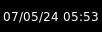
format='%d/%m/%y %H:%M'Configuration options
key
default
description
backgroundNoneWidget background color
fmt'{}'Format to apply to the string returned by the widget. Main purpose: applying markup. For a widget that returns
foo, usingfmt='<i>{}</i>'would give you<i>foo</i>. To control what the widget outputs in the first place, use theformatparamater of the widget (if it has one).font'sans'Default font
fontshadowNonefont shadow color, default is None(no shadow)
fontsizeNoneFont size. Calculated if None.
foreground'ffffff'Foreground colour
format'%H:%M'A Python datetime format string
markupTrueWhether or not to use pango markup
max_chars0Maximum number of characters to display in widget.
mouse_callbacks{}Dict of mouse button press callback functions. Accepts functions and
lazycalls.paddingNonePadding. Calculated if None.
scrollFalseWhether text should be scrolled. When True, you must set the widget's
width.scroll_clearFalseWhether text should scroll completely away (True) or stop when the end of the text is shown (False)
scroll_delay2Number of seconds to pause before starting scrolling and restarting/clearing text at end
scroll_fixed_widthFalseWhen
scroll=Truethewidthparameter is a maximum width and, when text is shorter than this, the widget will resize. Settingscroll_fixed_width=Truewill force the widget to have a fixed width, regardless of the size of the text.scroll_hideFalseWhether the widget should hide when scrolling has finished
scroll_interval0.1Time in seconds before next scrolling step
scroll_repeatTrueWhether text should restart scrolling once the text has ended
scroll_step1Number of pixels to scroll with each step
timezoneNoneThe timezone to use for this clock, either as string if pytz or dateutil is installed (e.g. "US/Central" or anything in /usr/share/zoneinfo), or as tzinfo (e.g. datetime.timezone.utc). None means the system local timezone and is the default.
update_interval1.0Update interval for the clock
Available commands
Click to view the available commands for
Clock
Cmus
- class libqtile.widget.Cmus(*args, **kwargs)[source]
A simple Cmus widget.
Show the metadata of now listening song and allow basic mouse control from the bar:
toggle pause (or play if stopped) on left click;
skip forward in playlist on scroll up;
skip backward in playlist on scroll down.
Cmus (https://cmus.github.io) should be installed.
Supported bar orientations: horizontal and vertical
example config 
default Configuration options
key
default
description
backgroundNoneWidget background color
fmt'{}'Format to apply to the string returned by the widget. Main purpose: applying markup. For a widget that returns
foo, usingfmt='<i>{}</i>'would give you<i>foo</i>. To control what the widget outputs in the first place, use theformatparamater of the widget (if it has one).font'sans'Default font
fontshadowNonefont shadow color, default is None(no shadow)
fontsizeNoneFont size. Calculated if None.
foreground'ffffff'Foreground colour
format'{play_icon}{artist} - {title}'Format of playback info.
markupTrueWhether or not to use pango markup
max_chars0Maximum number of characters to display in widget.
mouse_callbacks{}Dict of mouse button press callback functions. Accepts functions and
lazycalls.noplay_color'cecece'Text colour when not playing.
paddingNonePadding. Calculated if None.
play_color'00ff00'Text colour when playing.
play_icon'♫ 'Icon to display, if chosen.
scrollFalseWhether text should be scrolled. When True, you must set the widget's
width.scroll_clearFalseWhether text should scroll completely away (True) or stop when the end of the text is shown (False)
scroll_delay2Number of seconds to pause before starting scrolling and restarting/clearing text at end
scroll_fixed_widthFalseWhen
scroll=Truethewidthparameter is a maximum width and, when text is shorter than this, the widget will resize. Settingscroll_fixed_width=Truewill force the widget to have a fixed width, regardless of the size of the text.scroll_hideFalseWhether the widget should hide when scrolling has finished
scroll_interval0.1Time in seconds before next scrolling step
scroll_repeatTrueWhether text should restart scrolling once the text has ended
scroll_step1Number of pixels to scroll with each step
update_interval0.5Update Time in seconds.
Available commands
Click to view the available commands for
Cmus
Countdown
- class libqtile.widget.Countdown(*args, **kwargs)[source]
A simple countdown timer text widget
Supported bar orientations: horizontal and vertical
example config 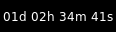
date=datetime.datetime(2024, 4, 24, 16, 13, 45, 673026)Configuration options
key
default
description
backgroundNoneWidget background color
datedatetime.datetime(2024, 4, 23, 13, 39, 51, 537622)The datetime for the end of the countdown
fmt'{}'Format to apply to the string returned by the widget. Main purpose: applying markup. For a widget that returns
foo, usingfmt='<i>{}</i>'would give you<i>foo</i>. To control what the widget outputs in the first place, use theformatparamater of the widget (if it has one).font'sans'Default font
fontshadowNonefont shadow color, default is None(no shadow)
fontsizeNoneFont size. Calculated if None.
foreground'ffffff'Foreground colour
format'{D}d {H}h {M}m {S}s'Format of the displayed text. Available variables:{D} == days, {H} == hours, {M} == minutes, {S} seconds.
markupTrueWhether or not to use pango markup
max_chars0Maximum number of characters to display in widget.
mouse_callbacks{}Dict of mouse button press callback functions. Accepts functions and
lazycalls.paddingNonePadding. Calculated if None.
scrollFalseWhether text should be scrolled. When True, you must set the widget's
width.scroll_clearFalseWhether text should scroll completely away (True) or stop when the end of the text is shown (False)
scroll_delay2Number of seconds to pause before starting scrolling and restarting/clearing text at end
scroll_fixed_widthFalseWhen
scroll=Truethewidthparameter is a maximum width and, when text is shorter than this, the widget will resize. Settingscroll_fixed_width=Truewill force the widget to have a fixed width, regardless of the size of the text.scroll_hideFalseWhether the widget should hide when scrolling has finished
scroll_interval0.1Time in seconds before next scrolling step
scroll_repeatTrueWhether text should restart scrolling once the text has ended
scroll_step1Number of pixels to scroll with each step
update_interval1.0Update interval in seconds for the clock
Available commands
Click to view the available commands for
Countdown
CryptoTicker
- class libqtile.widget.CryptoTicker(*args, **kwargs)[source]
A cryptocurrency ticker widget, data provided by the coinbase.com or the binance.com API. Defaults to displaying currency in whatever the current locale is. Examples:
# display the average price of bitcoin in local currency widget.CryptoTicker()
# display it in Euros: widget.CryptoTicker(currency="EUR")
# or a different cryptocurrency! widget.CryptoTicker(crypto="ETH")
# change the currency symbol: widget.CryptoTicker(currency="EUR", symbol="€")
# display from Binance API widget.CryptoTicker(api="binance", currency="USDT")
Supported bar orientations: horizontal and vertical
example config 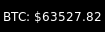
default 
format='{crypto}:{amount:,.2f}'Configuration options
key
default
description
api'coinbase'API that provides the data.
backgroundNoneWidget background color
crypto'BTC'The cryptocurrency to display.
currency''The baseline currency that the value of the crypto is displayed in.
dataNonePost Data
fmt'{}'Format to apply to the string returned by the widget. Main purpose: applying markup. For a widget that returns
foo, usingfmt='<i>{}</i>'would give you<i>foo</i>. To control what the widget outputs in the first place, use theformatparamater of the widget (if it has one).font'sans'Default font
fontshadowNonefont shadow color, default is None(no shadow)
fontsizeNoneFont size. Calculated if None.
foreground'ffffff'Foreground colour
format'{crypto}: {symbol}{amount:.2f}'Display string formatting.
headers{}Extra Headers
jsonTrueIs Json?
markupTrueWhether or not to use pango markup
max_chars0Maximum number of characters to display in widget.
mouse_callbacks{}Dict of mouse button press callback functions. Accepts functions and
lazycalls.paddingNonePadding. Calculated if None.
parseNoneParse Function
scrollFalseWhether text should be scrolled. When True, you must set the widget's
width.scroll_clearFalseWhether text should scroll completely away (True) or stop when the end of the text is shown (False)
scroll_delay2Number of seconds to pause before starting scrolling and restarting/clearing text at end
scroll_fixed_widthFalseWhen
scroll=Truethewidthparameter is a maximum width and, when text is shorter than this, the widget will resize. Settingscroll_fixed_width=Truewill force the widget to have a fixed width, regardless of the size of the text.scroll_hideFalseWhether the widget should hide when scrolling has finished
scroll_interval0.1Time in seconds before next scrolling step
scroll_repeatTrueWhether text should restart scrolling once the text has ended
scroll_step1Number of pixels to scroll with each step
symbol''The symbol for the baseline currency.
update_interval600Update interval in seconds, if none, the widget updates only once.
urlNoneUrl
user_agent'Qtile'Set the user agent
xmlFalseIs XML?
Available commands
Click to view the available commands for
CryptoTicker
CurrentLayout
- class libqtile.widget.CurrentLayout(*args, **kwargs)[source]
Display the name of the current layout of the current group of the screen, the bar containing the widget, is on.
Supported bar orientations: horizontal and vertical
Configuration options
key
default
description
backgroundNoneWidget background color
fmt'{}'Format to apply to the string returned by the widget. Main purpose: applying markup. For a widget that returns
foo, usingfmt='<i>{}</i>'would give you<i>foo</i>. To control what the widget outputs in the first place, use theformatparamater of the widget (if it has one).font'sans'Default font
fontshadowNonefont shadow color, default is None(no shadow)
fontsizeNoneFont size. Calculated if None.
foreground'ffffff'Foreground colour
markupTrueWhether or not to use pango markup
max_chars0Maximum number of characters to display in widget.
mouse_callbacks{}Dict of mouse button press callback functions. Accepts functions and
lazycalls.paddingNonePadding. Calculated if None.
scrollFalseWhether text should be scrolled. When True, you must set the widget's
width.scroll_clearFalseWhether text should scroll completely away (True) or stop when the end of the text is shown (False)
scroll_delay2Number of seconds to pause before starting scrolling and restarting/clearing text at end
scroll_fixed_widthFalseWhen
scroll=Truethewidthparameter is a maximum width and, when text is shorter than this, the widget will resize. Settingscroll_fixed_width=Truewill force the widget to have a fixed width, regardless of the size of the text.scroll_hideFalseWhether the widget should hide when scrolling has finished
scroll_interval0.1Time in seconds before next scrolling step
scroll_repeatTrueWhether text should restart scrolling once the text has ended
scroll_step1Number of pixels to scroll with each step
Available commands
Click to view the available commands for
CurrentLayout
CurrentLayoutIcon
- class libqtile.widget.CurrentLayoutIcon(*args, **kwargs)[source]
Display the icon representing the current layout of the current group of the screen on which the bar containing the widget is.
If you are using custom layouts, a default icon with question mark will be displayed for them. If you want to use custom icon for your own layout, for example, FooGrid, then create a file named "layout-foogrid.png" and place it in ~/.icons directory. You can as well use other directories, but then you need to specify those directories in custom_icon_paths argument for this plugin.
The widget will look for icons with a png or svg extension.
The order of icon search is:
dirs in custom_icon_paths config argument
~/.icons
built-in qtile icons
Supported bar orientations: horizontal only
Configuration options
key
default
description
backgroundNoneWidget background color
custom_icon_paths[]List of folders where to search icons beforeusing built-in icons or icons in ~/.icons dir. This can also be used to providemissing icons for custom layouts. Defaults to empty list.
fmt'{}'Format to apply to the string returned by the widget. Main purpose: applying markup. For a widget that returns
foo, usingfmt='<i>{}</i>'would give you<i>foo</i>. To control what the widget outputs in the first place, use theformatparamater of the widget (if it has one).font'sans'Default font
fontshadowNonefont shadow color, default is None(no shadow)
fontsizeNoneFont size. Calculated if None.
foreground'ffffff'Foreground colour
markupTrueWhether or not to use pango markup
max_chars0Maximum number of characters to display in widget.
mouse_callbacks{}Dict of mouse button press callback functions. Accepts functions and
lazycalls.paddingNonePadding. Calculated if None.
scale1Scale factor relative to the bar height. Defaults to 1
scrollFalseWhether text should be scrolled. When True, you must set the widget's
width.scroll_clearFalseWhether text should scroll completely away (True) or stop when the end of the text is shown (False)
scroll_delay2Number of seconds to pause before starting scrolling and restarting/clearing text at end
scroll_fixed_widthFalseWhen
scroll=Truethewidthparameter is a maximum width and, when text is shorter than this, the widget will resize. Settingscroll_fixed_width=Truewill force the widget to have a fixed width, regardless of the size of the text.scroll_hideFalseWhether the widget should hide when scrolling has finished
scroll_interval0.1Time in seconds before next scrolling step
scroll_repeatTrueWhether text should restart scrolling once the text has ended
scroll_step1Number of pixels to scroll with each step
Available commands
Click to view the available commands for
CurrentLayoutIcon
CurrentScreen
- class libqtile.widget.CurrentScreen(*args, **kwargs)[source]
Indicates whether the screen this widget is on is currently active or not
Supported bar orientations: horizontal and vertical
example config 
default 
default Configuration options
key
default
description
active_color'00ff00'Color when screen is active
active_text'A'Text displayed when the screen is active
backgroundNoneWidget background color
fmt'{}'Format to apply to the string returned by the widget. Main purpose: applying markup. For a widget that returns
foo, usingfmt='<i>{}</i>'would give you<i>foo</i>. To control what the widget outputs in the first place, use theformatparamater of the widget (if it has one).font'sans'Default font
fontshadowNonefont shadow color, default is None(no shadow)
fontsizeNoneFont size. Calculated if None.
foreground'ffffff'Foreground colour
inactive_color'ff0000'Color when screen is inactive
inactive_text'I'Text displayed when the screen is inactive
markupTrueWhether or not to use pango markup
max_chars0Maximum number of characters to display in widget.
mouse_callbacks{}Dict of mouse button press callback functions. Accepts functions and
lazycalls.paddingNonePadding. Calculated if None.
scrollFalseWhether text should be scrolled. When True, you must set the widget's
width.scroll_clearFalseWhether text should scroll completely away (True) or stop when the end of the text is shown (False)
scroll_delay2Number of seconds to pause before starting scrolling and restarting/clearing text at end
scroll_fixed_widthFalseWhen
scroll=Truethewidthparameter is a maximum width and, when text is shorter than this, the widget will resize. Settingscroll_fixed_width=Truewill force the widget to have a fixed width, regardless of the size of the text.scroll_hideFalseWhether the widget should hide when scrolling has finished
scroll_interval0.1Time in seconds before next scrolling step
scroll_repeatTrueWhether text should restart scrolling once the text has ended
scroll_step1Number of pixels to scroll with each step
Available commands
Click to view the available commands for
CurrentScreen
DF
- class libqtile.widget.DF(*args, **kwargs)[source]
Disk Free Widget
By default the widget only displays if the space is less than warn_space.
Supported bar orientations: horizontal and vertical
example config 
warn_space=40
visible_on_warn=FalseConfiguration options
key
default
description
backgroundNoneWidget background color
fmt'{}'Format to apply to the string returned by the widget. Main purpose: applying markup. For a widget that returns
foo, usingfmt='<i>{}</i>'would give you<i>foo</i>. To control what the widget outputs in the first place, use theformatparamater of the widget (if it has one).font'sans'Default font
fontshadowNonefont shadow color, default is None(no shadow)
fontsizeNoneFont size. Calculated if None.
foreground'ffffff'Foreground colour
format'{p} ({uf}{m}|{r:.0f}%)'String format (p: partition, s: size, f: free space, uf: user free space, m: measure, r: ratio (uf/s))
markupTrueWhether or not to use pango markup
max_chars0Maximum number of characters to display in widget.
measure'G'Measurement (G, M, B)
mouse_callbacks{}Dict of mouse button press callback functions. Accepts functions and
lazycalls.paddingNonePadding. Calculated if None.
partition'/'the partition to check space
scrollFalseWhether text should be scrolled. When True, you must set the widget's
width.scroll_clearFalseWhether text should scroll completely away (True) or stop when the end of the text is shown (False)
scroll_delay2Number of seconds to pause before starting scrolling and restarting/clearing text at end
scroll_fixed_widthFalseWhen
scroll=Truethewidthparameter is a maximum width and, when text is shorter than this, the widget will resize. Settingscroll_fixed_width=Truewill force the widget to have a fixed width, regardless of the size of the text.scroll_hideFalseWhether the widget should hide when scrolling has finished
scroll_interval0.1Time in seconds before next scrolling step
scroll_repeatTrueWhether text should restart scrolling once the text has ended
scroll_step1Number of pixels to scroll with each step
update_interval60The update interval.
visible_on_warnTrueOnly display if warning
warn_color'ff0000'Warning color
warn_space2Warning space in scale defined by the
measureoption.Available commands
Click to view the available commands for
DF
DoNotDisturb
- class libqtile.widget.DoNotDisturb(*args, **kwargs)[source]
Displays Do Not Disturb status for notification server Dunst by default. Can be used with other servers by changing the poll command and mouse callbacks.
Supported bar orientations: horizontal and vertical
example config 
default Configuration options
key
default
description
backgroundNoneWidget background color
disabled_icon'O'Icon that displays when do not disturb is disabled
enabled_icon'X'Icon that displays when do not disturb is enabled
fmt'{}'Format to apply to the string returned by the widget. Main purpose: applying markup. For a widget that returns
foo, usingfmt='<i>{}</i>'would give you<i>foo</i>. To control what the widget outputs in the first place, use theformatparamater of the widget (if it has one).font'sans'Default font
fontshadowNonefont shadow color, default is None(no shadow)
fontsizeNoneFont size. Calculated if None.
foreground'ffffff'Foreground colour
markupTrueWhether or not to use pango markup
max_chars0Maximum number of characters to display in widget.
mouse_callbacks{}Dict of mouse button press callback functions. Accepts functions and
lazycalls.paddingNonePadding. Calculated if None.
poll_functionNoneFunction that returns the notification server status. Define the function on your configuration file and pass it like poll_function=my_func. Must return either true or false
scrollFalseWhether text should be scrolled. When True, you must set the widget's
width.scroll_clearFalseWhether text should scroll completely away (True) or stop when the end of the text is shown (False)
scroll_delay2Number of seconds to pause before starting scrolling and restarting/clearing text at end
scroll_fixed_widthFalseWhen
scroll=Truethewidthparameter is a maximum width and, when text is shorter than this, the widget will resize. Settingscroll_fixed_width=Truewill force the widget to have a fixed width, regardless of the size of the text.scroll_hideFalseWhether the widget should hide when scrolling has finished
scroll_interval0.1Time in seconds before next scrolling step
scroll_repeatTrueWhether text should restart scrolling once the text has ended
scroll_step1Number of pixels to scroll with each step
update_interval1How often in seconds the text must update
Available commands
Click to view the available commands for
DoNotDisturb
GenPollCommand
- class libqtile.widget.GenPollCommand(*args, **kwargs)[source]
A generic text widget to display output from scripts or shell commands
Supported bar orientations: horizontal and vertical
Configuration options
key
default
description
backgroundNoneWidget background color
cmdNonecommand line as a string or list of arguments to execute
fmt'{}'Format to apply to the string returned by the widget. Main purpose: applying markup. For a widget that returns
foo, usingfmt='<i>{}</i>'would give you<i>foo</i>. To control what the widget outputs in the first place, use theformatparamater of the widget (if it has one).font'sans'Default font
fontshadowNonefont shadow color, default is None(no shadow)
fontsizeNoneFont size. Calculated if None.
foreground'ffffff'Foreground colour
markupTrueWhether or not to use pango markup
max_chars0Maximum number of characters to display in widget.
mouse_callbacks{}Dict of mouse button press callback functions. Accepts functions and
lazycalls.paddingNonePadding. Calculated if None.
scrollFalseWhether text should be scrolled. When True, you must set the widget's
width.scroll_clearFalseWhether text should scroll completely away (True) or stop when the end of the text is shown (False)
scroll_delay2Number of seconds to pause before starting scrolling and restarting/clearing text at end
scroll_fixed_widthFalseWhen
scroll=Truethewidthparameter is a maximum width and, when text is shorter than this, the widget will resize. Settingscroll_fixed_width=Truewill force the widget to have a fixed width, regardless of the size of the text.scroll_hideFalseWhether the widget should hide when scrolling has finished
scroll_interval0.1Time in seconds before next scrolling step
scroll_repeatTrueWhether text should restart scrolling once the text has ended
scroll_step1Number of pixels to scroll with each step
shellFalserun command through shell to enable piping and shell expansion
update_interval60update time in seconds
Available commands
Click to view the available commands for
GenPollCommand
GenPollText
- class libqtile.widget.GenPollText(*args, **kwargs)[source]
A generic text widget that polls using poll function to get the text
Supported bar orientations: horizontal and vertical
example config 
func=at 0x7f0efb805e10> Configuration options
key
default
description
backgroundNoneWidget background color
fmt'{}'Format to apply to the string returned by the widget. Main purpose: applying markup. For a widget that returns
foo, usingfmt='<i>{}</i>'would give you<i>foo</i>. To control what the widget outputs in the first place, use theformatparamater of the widget (if it has one).font'sans'Default font
fontshadowNonefont shadow color, default is None(no shadow)
fontsizeNoneFont size. Calculated if None.
foreground'ffffff'Foreground colour
funcNonePoll Function
markupTrueWhether or not to use pango markup
max_chars0Maximum number of characters to display in widget.
mouse_callbacks{}Dict of mouse button press callback functions. Accepts functions and
lazycalls.paddingNonePadding. Calculated if None.
scrollFalseWhether text should be scrolled. When True, you must set the widget's
width.scroll_clearFalseWhether text should scroll completely away (True) or stop when the end of the text is shown (False)
scroll_delay2Number of seconds to pause before starting scrolling and restarting/clearing text at end
scroll_fixed_widthFalseWhen
scroll=Truethewidthparameter is a maximum width and, when text is shorter than this, the widget will resize. Settingscroll_fixed_width=Truewill force the widget to have a fixed width, regardless of the size of the text.scroll_hideFalseWhether the widget should hide when scrolling has finished
scroll_interval0.1Time in seconds before next scrolling step
scroll_repeatTrueWhether text should restart scrolling once the text has ended
scroll_step1Number of pixels to scroll with each step
update_interval600Update interval in seconds, if none, the widget updates only once.
Available commands
Click to view the available commands for
GenPollText
GenPollUrl
- class libqtile.widget.GenPollUrl(*args, **kwargs)[source]
A generic text widget that polls an url and parses it using parse function
Supported bar orientations: horizontal and vertical
example config 
default 
url='http://test.qtile.org', json=False, parse=at 0x7f0efb871ab0> Configuration options
key
default
description
backgroundNoneWidget background color
dataNonePost Data
fmt'{}'Format to apply to the string returned by the widget. Main purpose: applying markup. For a widget that returns
foo, usingfmt='<i>{}</i>'would give you<i>foo</i>. To control what the widget outputs in the first place, use theformatparamater of the widget (if it has one).font'sans'Default font
fontshadowNonefont shadow color, default is None(no shadow)
fontsizeNoneFont size. Calculated if None.
foreground'ffffff'Foreground colour
headers{}Extra Headers
jsonTrueIs Json?
markupTrueWhether or not to use pango markup
max_chars0Maximum number of characters to display in widget.
mouse_callbacks{}Dict of mouse button press callback functions. Accepts functions and
lazycalls.paddingNonePadding. Calculated if None.
parseNoneParse Function
scrollFalseWhether text should be scrolled. When True, you must set the widget's
width.scroll_clearFalseWhether text should scroll completely away (True) or stop when the end of the text is shown (False)
scroll_delay2Number of seconds to pause before starting scrolling and restarting/clearing text at end
scroll_fixed_widthFalseWhen
scroll=Truethewidthparameter is a maximum width and, when text is shorter than this, the widget will resize. Settingscroll_fixed_width=Truewill force the widget to have a fixed width, regardless of the size of the text.scroll_hideFalseWhether the widget should hide when scrolling has finished
scroll_interval0.1Time in seconds before next scrolling step
scroll_repeatTrueWhether text should restart scrolling once the text has ended
scroll_step1Number of pixels to scroll with each step
update_interval600Update interval in seconds, if none, the widget updates only once.
urlNoneUrl
user_agent'Qtile'Set the user agent
xmlFalseIs XML?
Available commands
Click to view the available commands for
GenPollUrl
GmailChecker
- class libqtile.widget.GmailChecker(*args, **kwargs)[source]
A simple gmail checker. If 'status_only_unseen' is True - set 'fmt' for one argument, ex. 'unseen: {0}'
Supported bar orientations: horizontal and vertical
example config 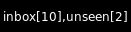
username='qtile', password='qtile'
username='qtile', password='qtile', display_fmt='unseen[{0}]', status_only_unseen=TrueConfiguration options
key
default
description
backgroundNoneWidget background color
display_fmt'inbox[{0}],unseen[{1}]'Display format
email_path'INBOX'email_path
fmt'{}'Format to apply to the string returned by the widget. Main purpose: applying markup. For a widget that returns
foo, usingfmt='<i>{}</i>'would give you<i>foo</i>. To control what the widget outputs in the first place, use theformatparamater of the widget (if it has one).font'sans'Default font
fontshadowNonefont shadow color, default is None(no shadow)
fontsizeNoneFont size. Calculated if None.
foreground'ffffff'Foreground colour
markupTrueWhether or not to use pango markup
max_chars0Maximum number of characters to display in widget.
mouse_callbacks{}Dict of mouse button press callback functions. Accepts functions and
lazycalls.paddingNonePadding. Calculated if None.
passwordNonepassword
scrollFalseWhether text should be scrolled. When True, you must set the widget's
width.scroll_clearFalseWhether text should scroll completely away (True) or stop when the end of the text is shown (False)
scroll_delay2Number of seconds to pause before starting scrolling and restarting/clearing text at end
scroll_fixed_widthFalseWhen
scroll=Truethewidthparameter is a maximum width and, when text is shorter than this, the widget will resize. Settingscroll_fixed_width=Truewill force the widget to have a fixed width, regardless of the size of the text.scroll_hideFalseWhether the widget should hide when scrolling has finished
scroll_interval0.1Time in seconds before next scrolling step
scroll_repeatTrueWhether text should restart scrolling once the text has ended
scroll_step1Number of pixels to scroll with each step
status_only_unseenFalseOnly show unseen messages
update_interval30Update time in seconds.
usernameNoneusername
Available commands
Click to view the available commands for
GmailChecker
GroupBox
- class libqtile.widget.GroupBox(*args, **kwargs)[source]
A widget that graphically displays the current group. All groups are displayed by their label. If the label of a group is the empty string that group will not be displayed.
Supported bar orientations: horizontal only
example config 
default 
highlight_method='block'
highlight_method='text'
highlight_method='line'
visible_groups=['1', '5', '6']Configuration options
key
default
description
active'FFFFFF'Active group font colour
backgroundNoneWidget background color
block_highlight_text_colorNoneSelected group font colour
borderwidth3Current group border width
center_alignedTruecenter-aligned group box
disable_dragFalseDisable dragging and dropping of group names on widget
fmt'{}'Format to apply to the string returned by the widget. Main purpose: applying markup. For a widget that returns
foo, usingfmt='<i>{}</i>'would give you<i>foo</i>. To control what the widget outputs in the first place, use theformatparamater of the widget (if it has one).font'sans'Default font
fontshadowNonefont shadow color, default is None(no shadow)
fontsizeNoneFont size. Calculated if None.
foreground'ffffff'Foreground colour
hide_unusedFalseHide groups that have no windows and that are not displayed on any screen.
highlight_color['000000', '282828']Active group highlight color when using 'line' highlight method.
highlight_method'border'Method of highlighting ('border', 'block', 'text', or 'line')Uses *_border color settings
inactive'404040'Inactive group font colour
invert_mouse_wheelFalseWhether to invert mouse wheel group movement
margin3Margin inside the box
margin_xNoneX Margin. Overrides 'margin' if set
margin_yNoneY Margin. Overrides 'margin' if set
markupFalseWhether or not to use pango markup
max_chars0Maximum number of characters to display in widget.
mouse_callbacks{}Dict of mouse button press callback functions. Accepts functions and
lazycalls.other_current_screen_border'404040'Border or line colour for group on other screen when focused.
other_screen_border'404040'Border or line colour for group on other screen when unfocused.
paddingNonePadding. Calculated if None.
padding_xNoneX Padding. Overrides 'padding' if set
padding_yNoneY Padding. Overrides 'padding' if set
roundedTrueTo round or not to round box borders
scrollFalseWhether text should be scrolled. When True, you must set the widget's
width.scroll_clearFalseWhether text should scroll completely away (True) or stop when the end of the text is shown (False)
scroll_delay2Number of seconds to pause before starting scrolling and restarting/clearing text at end
scroll_fixed_widthFalseWhen
scroll=Truethewidthparameter is a maximum width and, when text is shorter than this, the widget will resize. Settingscroll_fixed_width=Truewill force the widget to have a fixed width, regardless of the size of the text.scroll_hideFalseWhether the widget should hide when scrolling has finished
scroll_interval0.1Time in seconds before next scrolling step
scroll_repeatTrueWhether text should restart scrolling once the text has ended
scroll_step1Number of pixels to scroll with each step
spacingNoneSpacing between groups(if set to None, will be equal to margin_x)
this_current_screen_border'215578'Border or line colour for group on this screen when focused.
this_screen_border'215578'Border or line colour for group on this screen when unfocused.
toggleTrueEnable toggling of group when clicking on same group name
urgent_alert_method'border'Method for alerting you of WM urgent hints (one of 'border', 'text', 'block', or 'line')
urgent_border'FF0000'Urgent border or line color
urgent_text'FF0000'Urgent group font color
use_mouse_wheelTrueWhether to use mouse wheel events
visible_groupsNoneGroups that will be visible. If set to None or [], all groups will be visible.Visible groups are identified by name not by their displayed label.
Available commands
Click to view the available commands for
GroupBox
HDDBusyGraph
- class libqtile.widget.HDDBusyGraph(*args, **kwargs)[source]
Display HDD busy time graph
Parses /sys/block/<dev>/stat file and extracts overall device IO usage, based on
io_ticks's value. See https://www.kernel.org/doc/Documentation/block/stat.txtSupported bar orientations: horizontal only
example config 
default 
type='box'
type='line'
type='line', line_width=1
start_pos='top'Configuration options
key
default
description
backgroundNoneWidget background color
border_color'215578'Widget border color
border_width2Widget border width
device'sda'Block device to display info for
fill_color'1667EB.3'Fill color for linefill graph
frequency1Update frequency in seconds
graph_color'18BAEB'Graph color
line_width3Line width
margin_x3Margin X
margin_y3Margin Y
mouse_callbacks{}Dict of mouse button press callback functions. Accepts functions and
lazycalls.samples100Count of graph samples.
start_pos'bottom'Drawer starting position ('bottom'/'top')
type'linefill''box', 'line', 'linefill'
Available commands
Click to view the available commands for
HDDBusyGraph
HDDGraph
- class libqtile.widget.HDDGraph(*args, **kwargs)[source]
Display HDD free or used space graph
Supported bar orientations: horizontal only
example config 
default 
type='box'
type='line'
type='line', line_width=1
start_pos='top'Configuration options
key
default
description
backgroundNoneWidget background color
border_color'215578'Widget border color
border_width2Widget border width
fill_color'1667EB.3'Fill color for linefill graph
frequency1Update frequency in seconds
graph_color'18BAEB'Graph color
line_width3Line width
margin_x3Margin X
margin_y3Margin Y
mouse_callbacks{}Dict of mouse button press callback functions. Accepts functions and
lazycalls.path'/'Partition mount point.
samples100Count of graph samples.
space_type'used'free/used
start_pos'bottom'Drawer starting position ('bottom'/'top')
type'linefill''box', 'line', 'linefill'
Available commands
Click to view the available commands for
HDDGraph
IdleRPG
- class libqtile.widget.IdleRPG(*args, **kwargs)[source]
A widget for monitoring and displaying IdleRPG stats.
# display idlerpg stats for the player 'pants' on freenode's #idlerpg
widget.IdleRPG(url="http://xethron.lolhosting.net/xml.php?player=pants")
Widget requirements: xmltodict.
Supported bar orientations: horizontal and vertical
example config 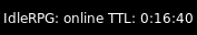
url='http://idlerpg.qtile.org?player=elParaguayo'Configuration options
key
default
description
backgroundNoneWidget background color
dataNonePost Data
fmt'{}'Format to apply to the string returned by the widget. Main purpose: applying markup. For a widget that returns
foo, usingfmt='<i>{}</i>'would give you<i>foo</i>. To control what the widget outputs in the first place, use theformatparamater of the widget (if it has one).font'sans'Default font
fontshadowNonefont shadow color, default is None(no shadow)
fontsizeNoneFont size. Calculated if None.
foreground'ffffff'Foreground colour
format'IdleRPG: {online} TTL: {ttl}'Display format
headers{}Extra Headers
jsonTrueIs Json?
markupTrueWhether or not to use pango markup
max_chars0Maximum number of characters to display in widget.
mouse_callbacks{}Dict of mouse button press callback functions. Accepts functions and
lazycalls.paddingNonePadding. Calculated if None.
parseNoneParse Function
scrollFalseWhether text should be scrolled. When True, you must set the widget's
width.scroll_clearFalseWhether text should scroll completely away (True) or stop when the end of the text is shown (False)
scroll_delay2Number of seconds to pause before starting scrolling and restarting/clearing text at end
scroll_fixed_widthFalseWhen
scroll=Truethewidthparameter is a maximum width and, when text is shorter than this, the widget will resize. Settingscroll_fixed_width=Truewill force the widget to have a fixed width, regardless of the size of the text.scroll_hideFalseWhether the widget should hide when scrolling has finished
scroll_interval0.1Time in seconds before next scrolling step
scroll_repeatTrueWhether text should restart scrolling once the text has ended
scroll_step1Number of pixels to scroll with each step
update_interval600Update interval in seconds, if none, the widget updates only once.
urlNoneUrl
user_agent'Qtile'Set the user agent
xmlFalseIs XML?
Available commands
Click to view the available commands for
IdleRPG
Image
- class libqtile.widget.Image(*args, **kwargs)[source]
Display a PNG image on the bar
Supported bar orientations: horizontal and vertical
example config 
filename='/home/docs/checkouts/readthedocs.org/user_builds/qtile/checkouts/latest/test/widgets/docs_screenshots/../../scripts/qtile-logo-blue.svg'
filename='/home/docs/checkouts/readthedocs.org/user_builds/qtile/checkouts/latest/test/widgets/docs_screenshots/../../scripts/qtile-logo-blue.svg', margin=5
filename='/home/docs/checkouts/readthedocs.org/user_builds/qtile/checkouts/latest/test/widgets/docs_screenshots/../../scripts/qtile-logo-blue.svg', rotate=45Configuration options
key
default
description
backgroundNoneWidget background color
filenameNoneImage filename. Can contain '~'
margin3Margin inside the box
margin_xNoneX Margin. Overrides 'margin' if set
margin_yNoneY Margin. Overrides 'margin' if set
mouse_callbacks{}Dict of mouse button press callback functions. Accepts functions and
lazycalls.rotate0.0rotate the image in degrees counter-clockwise
scaleTrueEnable/Disable image scaling
Available commands
Click to view the available commands for
Image
ImapWidget
- class libqtile.widget.ImapWidget(*args, **kwargs)[source]
Email IMAP widget
This widget will scan one of your imap email boxes and report the number of unseen messages present. I've configured it to only work with imap with ssl. Your password is obtained from the Gnome Keyring.
Writing your password to the keyring initially is as simple as (changing out <userid> and <password> for your userid and password):
create the file ~/.local/share/python_keyring/keyringrc.cfg with the following contents:
[backend]
default-keyring=keyring.backends.Gnome.Keyring
keyring-path=/home/<userid>/.local/share/keyring/
Execute the following python shell script once:
#!/usr/bin/env python3
import keyring
user = <userid>
password = <password>
keyring.set_password('imapwidget', user, password)
mbox names must include the path to the mbox (except for the default INBOX). So, for example if your mailroot is
~/Maildir, and you want to look at the mailbox at HomeMail/fred, the mbox setting would be:mbox="~/Maildir/HomeMail/fred". Note the nested sets of quotes! Labels can be whatever you choose, of course.Widget requirements: keyring.
Supported bar orientations: horizontal and vertical
example config 
user='qtile'Configuration options
key
default
description
backgroundNoneWidget background color
fmt'{}'Format to apply to the string returned by the widget. Main purpose: applying markup. For a widget that returns
foo, usingfmt='<i>{}</i>'would give you<i>foo</i>. To control what the widget outputs in the first place, use theformatparamater of the widget (if it has one).font'sans'Default font
fontshadowNonefont shadow color, default is None(no shadow)
fontsizeNoneFont size. Calculated if None.
foreground'ffffff'Foreground colour
label'INBOX'label for display
markupTrueWhether or not to use pango markup
max_chars0Maximum number of characters to display in widget.
mbox'"INBOX"'mailbox to fetch
mouse_callbacks{}Dict of mouse button press callback functions. Accepts functions and
lazycalls.paddingNonePadding. Calculated if None.
scrollFalseWhether text should be scrolled. When True, you must set the widget's
width.scroll_clearFalseWhether text should scroll completely away (True) or stop when the end of the text is shown (False)
scroll_delay2Number of seconds to pause before starting scrolling and restarting/clearing text at end
scroll_fixed_widthFalseWhen
scroll=Truethewidthparameter is a maximum width and, when text is shorter than this, the widget will resize. Settingscroll_fixed_width=Truewill force the widget to have a fixed width, regardless of the size of the text.scroll_hideFalseWhether the widget should hide when scrolling has finished
scroll_interval0.1Time in seconds before next scrolling step
scroll_repeatTrueWhether text should restart scrolling once the text has ended
scroll_step1Number of pixels to scroll with each step
serverNoneemail server name
update_interval600Update interval in seconds, if none, the widget updates only once.
userNoneemail username
Available commands
Click to view the available commands for
ImapWidget
KeyboardKbdd
- class libqtile.widget.KeyboardKbdd(*args, **kwargs)[source]
Widget for changing keyboard layouts per window, using kbdd
kbdd should be installed and running, you can get it from: https://github.com/qnikst/kbdd
The widget also requires dbus-next.
Supported bar orientations: horizontal and vertical
example config 
configured_keyboards=['gb', 'us']Configuration options
key
default
description
backgroundNoneWidget background color
coloursNoneforeground colour for each layouteither 'None' or a list of colours.example: ['ffffff', 'E6F0AF'].
configured_keyboards['us', 'ir']your predefined list of keyboard layouts.example: ['us', 'ir', 'es']
fmt'{}'Format to apply to the string returned by the widget. Main purpose: applying markup. For a widget that returns
foo, usingfmt='<i>{}</i>'would give you<i>foo</i>. To control what the widget outputs in the first place, use theformatparamater of the widget (if it has one).font'sans'Default font
fontshadowNonefont shadow color, default is None(no shadow)
fontsizeNoneFont size. Calculated if None.
foreground'ffffff'Foreground colour
markupTrueWhether or not to use pango markup
max_chars0Maximum number of characters to display in widget.
mouse_callbacks{}Dict of mouse button press callback functions. Accepts functions and
lazycalls.paddingNonePadding. Calculated if None.
scrollFalseWhether text should be scrolled. When True, you must set the widget's
width.scroll_clearFalseWhether text should scroll completely away (True) or stop when the end of the text is shown (False)
scroll_delay2Number of seconds to pause before starting scrolling and restarting/clearing text at end
scroll_fixed_widthFalseWhen
scroll=Truethewidthparameter is a maximum width and, when text is shorter than this, the widget will resize. Settingscroll_fixed_width=Truewill force the widget to have a fixed width, regardless of the size of the text.scroll_hideFalseWhether the widget should hide when scrolling has finished
scroll_interval0.1Time in seconds before next scrolling step
scroll_repeatTrueWhether text should restart scrolling once the text has ended
scroll_step1Number of pixels to scroll with each step
update_interval1Update interval in seconds.
Available commands
Click to view the available commands for
KeyboardKbdd
KeyboardLayout
- class libqtile.widget.KeyboardLayout(*args, **kwargs)[source]
Widget for changing and displaying the current keyboard layout
To use this widget effectively you need to specify keyboard layouts you want to use (using "configured_keyboards") and bind function "next_keyboard" to specific keys in order to change layouts.
For example:
Key([mod], "space", lazy.widget["keyboardlayout"].next_keyboard(), desc="Next keyboard layout."),
When running Qtile with the X11 backend, this widget requires setxkbmap to be available. Xmodmap will also be used if .Xmodmap file is available.
Supported bar orientations: horizontal and vertical
Configuration options
key
default
description
backgroundNoneWidget background color
configured_keyboards['us']A list of predefined keyboard layouts represented as strings. For example: ['us', 'us colemak', 'es', 'fr'].
display_map{}Custom display of layout. Key should be in format 'layout variant'. For example: {'us': 'us', 'lt sgs': 'sgs', 'ru phonetic': 'ru'}
fmt'{}'Format to apply to the string returned by the widget. Main purpose: applying markup. For a widget that returns
foo, usingfmt='<i>{}</i>'would give you<i>foo</i>. To control what the widget outputs in the first place, use theformatparamater of the widget (if it has one).font'sans'Default font
fontshadowNonefont shadow color, default is None(no shadow)
fontsizeNoneFont size. Calculated if None.
foreground'ffffff'Foreground colour
markupTrueWhether or not to use pango markup
max_chars0Maximum number of characters to display in widget.
mouse_callbacks{}Dict of mouse button press callback functions. Accepts functions and
lazycalls.optionNonestring of setxkbmap option. Ex., 'compose:menu,grp_led:scroll'
paddingNonePadding. Calculated if None.
scrollFalseWhether text should be scrolled. When True, you must set the widget's
width.scroll_clearFalseWhether text should scroll completely away (True) or stop when the end of the text is shown (False)
scroll_delay2Number of seconds to pause before starting scrolling and restarting/clearing text at end
scroll_fixed_widthFalseWhen
scroll=Truethewidthparameter is a maximum width and, when text is shorter than this, the widget will resize. Settingscroll_fixed_width=Truewill force the widget to have a fixed width, regardless of the size of the text.scroll_hideFalseWhether the widget should hide when scrolling has finished
scroll_interval0.1Time in seconds before next scrolling step
scroll_repeatTrueWhether text should restart scrolling once the text has ended
scroll_step1Number of pixels to scroll with each step
update_interval1Update time in seconds.
Available commands
Click to view the available commands for
KeyboardLayout
KhalCalendar
- class libqtile.widget.KhalCalendar(*args, **kwargs)[source]
Khal calendar widget
This widget will display the next appointment on your Khal calendar in the qtile status bar. Appointments within the "reminder" time will be highlighted.
Widget requirements: dateutil.
Supported bar orientations: horizontal and vertical
Configuration options
key
default
description
backgroundNoneWidget background color
fmt'{}'Format to apply to the string returned by the widget. Main purpose: applying markup. For a widget that returns
foo, usingfmt='<i>{}</i>'would give you<i>foo</i>. To control what the widget outputs in the first place, use theformatparamater of the widget (if it has one).font'sans'Default font
fontshadowNonefont shadow color, default is None(no shadow)
fontsizeNoneFont size. Calculated if None.
foreground'FFFF33'default foreground color
lookahead7days to look ahead in the calendar
markupTrueWhether or not to use pango markup
max_chars0Maximum number of characters to display in widget.
mouse_callbacks{}Dict of mouse button press callback functions. Accepts functions and
lazycalls.paddingNonePadding. Calculated if None.
reminder_color'FF0000'color of calendar entries during reminder time
remindertime10reminder time in minutes
scrollFalseWhether text should be scrolled. When True, you must set the widget's
width.scroll_clearFalseWhether text should scroll completely away (True) or stop when the end of the text is shown (False)
scroll_delay2Number of seconds to pause before starting scrolling and restarting/clearing text at end
scroll_fixed_widthFalseWhen
scroll=Truethewidthparameter is a maximum width and, when text is shorter than this, the widget will resize. Settingscroll_fixed_width=Truewill force the widget to have a fixed width, regardless of the size of the text.scroll_hideFalseWhether the widget should hide when scrolling has finished
scroll_interval0.1Time in seconds before next scrolling step
scroll_repeatTrueWhether text should restart scrolling once the text has ended
scroll_step1Number of pixels to scroll with each step
update_interval600Update interval in seconds, if none, the widget updates only once.
Available commands
Click to view the available commands for
KhalCalendar
LaunchBar
- class libqtile.widget.LaunchBar(*args, **kwargs)[source]
This module defines a widget that displays icons to launch softwares or commands when clicked -- a launchbar. Only png icon files are displayed, not xpm because cairo doesn't support loading of xpm file. The order of displaying (from left to right) is in the order of the list.
If no icon was found for the name provided and if default_icon is set to None then the name is printed instead. If default_icon is defined then this icon is displayed instead.
- To execute a software:
('thunderbird', 'thunderbird -safe-mode', 'launch thunderbird in safe mode')
- To execute a python command in qtile, begin with by 'qshell:'
('/path/to/icon.png', 'qshell:self.qtile.shutdown()', 'logout from qtile')
Optional requirements: pyxdg for finding the icon path if it is not provided in the
progstuple.Supported bar orientations: horizontal only
Configuration options
key
default
description
backgroundNoneWidget background color
default_icon'/usr/share/icons/oxygen/256x256/mimetypes/application-x-executable.png'Default icon not found
font'sans'Text font
fontshadowNoneFont shadow color, default is None (no shadow)
fontsizeNoneFont pixel size. Calculated if None.
foreground'#ffffff'Text colour.
icon_sizeNoneSize of icons.
Noneto fit to bar.mouse_callbacks{}Dict of mouse button press callback functions. Accepts functions and
lazycalls.padding2Padding between icons
padding_y0Vertical adjustment for icons.
progs[]A list of tuples (software_name or icon_path, command_to_execute, comment), for example: [('thunderbird', 'thunderbird -safe-mode', 'launch thunderbird in safe mode'), ('/path/to/icon.png', 'qshell:self.qtile.shutdown()', 'logout from qtile')]
text_onlyFalseDon't use any icons.
theme_pathNonePath to icon theme to be used by pyxdg for icons.
Nonewill use default icon theme.Available commands
Click to view the available commands for
LaunchBar
Load
- class libqtile.widget.Load(*args, **kwargs)[source]
A small widget to show the load averages of the system. Depends on psutil.
Supported bar orientations: horizontal and vertical
example config 
default 
format='{time}: {load:.1f}'Configuration options
key
default
description
backgroundNoneWidget background color
fmt'{}'Format to apply to the string returned by the widget. Main purpose: applying markup. For a widget that returns
foo, usingfmt='<i>{}</i>'would give you<i>foo</i>. To control what the widget outputs in the first place, use theformatparamater of the widget (if it has one).font'sans'Default font
fontshadowNonefont shadow color, default is None(no shadow)
fontsizeNoneFont size. Calculated if None.
foreground'ffffff'Foreground colour
format'Load({time}):{load:.2f}'The format in which to display the results.
markupTrueWhether or not to use pango markup
max_chars0Maximum number of characters to display in widget.
mouse_callbacks{}Dict of mouse button press callback functions. Accepts functions and
lazycalls.paddingNonePadding. Calculated if None.
scrollFalseWhether text should be scrolled. When True, you must set the widget's
width.scroll_clearFalseWhether text should scroll completely away (True) or stop when the end of the text is shown (False)
scroll_delay2Number of seconds to pause before starting scrolling and restarting/clearing text at end
scroll_fixed_widthFalseWhen
scroll=Truethewidthparameter is a maximum width and, when text is shorter than this, the widget will resize. Settingscroll_fixed_width=Truewill force the widget to have a fixed width, regardless of the size of the text.scroll_hideFalseWhether the widget should hide when scrolling has finished
scroll_interval0.1Time in seconds before next scrolling step
scroll_repeatTrueWhether text should restart scrolling once the text has ended
scroll_step1Number of pixels to scroll with each step
update_interval1.0The update interval for the widget
Available commands
Click to view the available commands for
Load
Maildir
- class libqtile.widget.Maildir(*args, **kwargs)[source]
A simple widget showing the number of new mails in maildir mailboxes
Supported bar orientations: horizontal and vertical
Configuration options
key
default
description
backgroundNoneWidget background color
empty_colorNoneDisplay color when no new mail is available
fmt'{}'Format to apply to the string returned by the widget. Main purpose: applying markup. For a widget that returns
foo, usingfmt='<i>{}</i>'would give you<i>foo</i>. To control what the widget outputs in the first place, use theformatparamater of the widget (if it has one).font'sans'Default font
fontshadowNonefont shadow color, default is None(no shadow)
fontsizeNoneFont size. Calculated if None.
foreground'ffffff'Foreground colour
hide_when_emptyFalseWhether not to display anything if the subfolder has no new mail
maildir_path'~/Mail'path to the Maildir folder
markupTrueWhether or not to use pango markup
max_chars0Maximum number of characters to display in widget.
mouse_callbacks{}Dict of mouse button press callback functions. Accepts functions and
lazycalls.nonempty_colorNoneDisplay color when new mail is available
paddingNonePadding. Calculated if None.
scrollFalseWhether text should be scrolled. When True, you must set the widget's
width.scroll_clearFalseWhether text should scroll completely away (True) or stop when the end of the text is shown (False)
scroll_delay2Number of seconds to pause before starting scrolling and restarting/clearing text at end
scroll_fixed_widthFalseWhen
scroll=Truethewidthparameter is a maximum width and, when text is shorter than this, the widget will resize. Settingscroll_fixed_width=Truewill force the widget to have a fixed width, regardless of the size of the text.scroll_hideFalseWhether the widget should hide when scrolling has finished
scroll_interval0.1Time in seconds before next scrolling step
scroll_repeatTrueWhether text should restart scrolling once the text has ended
scroll_step1Number of pixels to scroll with each step
separator' 'the string to put between the subfolder strings.
sub_folders[{'label': 'Home mail', 'path': 'INBOX'}, {'label': 'Home junk', 'path': 'spam'}]List of subfolders to scan. Each subfolder is a dict of path and label.
subfolder_fmt'{label}: {value}'Display format for one subfolder
totalFalseWhether or not to sum subfolders into a grand total. The first label will be used.
update_interval600Update interval in seconds, if none, the widget updates only once.
Available commands
Click to view the available commands for
Maildir
Memory
- class libqtile.widget.Memory(*args, **kwargs)[source]
Display memory/swap usage.
The following fields are available in the format string:
MemUsed: Memory in use.MemTotal: Total amount of memory.MemFree: Amount of memory free.Available: Amount of memory available.MemPercent: Memory in use as a percentage.Buffers: Buffer amount.Active: Active memory.Inactive: Inactive memory.Shmem: Shared memory.SwapTotal: Total amount of swap.SwapFree: Amount of swap free.SwapUsed: Amount of swap in use.SwapPercent: Swap in use as a percentage.mm: Measure unit for memory.ms: Measure unit for swap.
Widget requirements: psutil.
Supported bar orientations: horizontal and vertical
example config 
default 
measure_mem='G'
format='Swap: {SwapUsed: .0f}{ms}/{SwapTotal: .0f}{ms}'Configuration options
key
default
description
backgroundNoneWidget background color
fmt'{}'Format to apply to the string returned by the widget. Main purpose: applying markup. For a widget that returns
foo, usingfmt='<i>{}</i>'would give you<i>foo</i>. To control what the widget outputs in the first place, use theformatparamater of the widget (if it has one).font'sans'Default font
fontshadowNonefont shadow color, default is None(no shadow)
fontsizeNoneFont size. Calculated if None.
foreground'ffffff'Foreground colour
format'{MemUsed: .0f}{mm}/{MemTotal: .0f}{mm}'Formatting for field names.
markupTrueWhether or not to use pango markup
max_chars0Maximum number of characters to display in widget.
measure_mem'M'Measurement for Memory (G, M, K, B)
measure_swap'M'Measurement for Swap (G, M, K, B)
mouse_callbacks{}Dict of mouse button press callback functions. Accepts functions and
lazycalls.paddingNonePadding. Calculated if None.
scrollFalseWhether text should be scrolled. When True, you must set the widget's
width.scroll_clearFalseWhether text should scroll completely away (True) or stop when the end of the text is shown (False)
scroll_delay2Number of seconds to pause before starting scrolling and restarting/clearing text at end
scroll_fixed_widthFalseWhen
scroll=Truethewidthparameter is a maximum width and, when text is shorter than this, the widget will resize. Settingscroll_fixed_width=Truewill force the widget to have a fixed width, regardless of the size of the text.scroll_hideFalseWhether the widget should hide when scrolling has finished
scroll_interval0.1Time in seconds before next scrolling step
scroll_repeatTrueWhether text should restart scrolling once the text has ended
scroll_step1Number of pixels to scroll with each step
update_interval1.0Update interval for the Memory
Available commands
Click to view the available commands for
Memory
MemoryGraph
- class libqtile.widget.MemoryGraph(*args, **kwargs)[source]
Displays a memory usage graph.
Widget requirements: psutil.
Supported bar orientations: horizontal only
example config 
default 
type='box'
type='line'
type='line', line_width=1
start_pos='top'Configuration options
key
default
description
backgroundNoneWidget background color
border_color'215578'Widget border color
border_width2Widget border width
fill_color'1667EB.3'Fill color for linefill graph
frequency1Update frequency in seconds
graph_color'18BAEB'Graph color
line_width3Line width
margin_x3Margin X
margin_y3Margin Y
mouse_callbacks{}Dict of mouse button press callback functions. Accepts functions and
lazycalls.samples100Count of graph samples.
start_pos'bottom'Drawer starting position ('bottom'/'top')
type'linefill''box', 'line', 'linefill'
Available commands
Click to view the available commands for
MemoryGraph
Moc
- class libqtile.widget.Moc(*args, **kwargs)[source]
A simple MOC widget.
Show the artist and album of now listening song and allow basic mouse control from the bar:
toggle pause (or play if stopped) on left click;
skip forward in playlist on scroll up;
skip backward in playlist on scroll down.
MOC (http://moc.daper.net) should be installed.
Supported bar orientations: horizontal and vertical
example config 
default Configuration options
key
default
description
backgroundNoneWidget background color
fmt'{}'Format to apply to the string returned by the widget. Main purpose: applying markup. For a widget that returns
foo, usingfmt='<i>{}</i>'would give you<i>foo</i>. To control what the widget outputs in the first place, use theformatparamater of the widget (if it has one).font'sans'Default font
fontshadowNonefont shadow color, default is None(no shadow)
fontsizeNoneFont size. Calculated if None.
foreground'ffffff'Foreground colour
markupTrueWhether or not to use pango markup
max_chars0Maximum number of characters to display in widget.
mouse_callbacks{}Dict of mouse button press callback functions. Accepts functions and
lazycalls.noplay_color'cecece'Text colour when not playing.
paddingNonePadding. Calculated if None.
play_color'00ff00'Text colour when playing.
scrollFalseWhether text should be scrolled. When True, you must set the widget's
width.scroll_clearFalseWhether text should scroll completely away (True) or stop when the end of the text is shown (False)
scroll_delay2Number of seconds to pause before starting scrolling and restarting/clearing text at end
scroll_fixed_widthFalseWhen
scroll=Truethewidthparameter is a maximum width and, when text is shorter than this, the widget will resize. Settingscroll_fixed_width=Truewill force the widget to have a fixed width, regardless of the size of the text.scroll_hideFalseWhether the widget should hide when scrolling has finished
scroll_interval0.1Time in seconds before next scrolling step
scroll_repeatTrueWhether text should restart scrolling once the text has ended
scroll_step1Number of pixels to scroll with each step
update_interval0.5Update Time in seconds.
Available commands
Click to view the available commands for
Moc
Mpd2
- class libqtile.widget.Mpd2(*args, **kwargs)[source]
Mpd2 Object.
- Parameters:
- status_format:
format string to display status
- For a full list of values, see:
MPDClient.status() and MPDClient.currentsong()
https://musicpd.org/doc/protocol/command_reference.html#command_status https://musicpd.org/doc/protocol/tags.html
Default:
'{play_status} {artist}/{title} \ [{repeat}{random}{single}{consume}{updating_db}]' ``play_status`` is a string from ``play_states`` dict Note that the ``time`` property of the song renamed to ``fulltime`` to prevent conflicts with status information during formating.- idle_format:
format string to display status when no song is in queue.
Default:
'{play_status} {idle_message} \ [{repeat}{random}{single}{consume}{updating_db}]' Note that the ``artist`` key fallbacks to similar keys in specific order. (``artist`` -> ``albumartist`` -> ``performer`` -> -> ``composer`` -> ``conductor`` -> ``ensemble``)- idle_message:
text to display instead of song information when MPD is idle. (i.e. no song in queue)
Default:: "MPD IDLE"
- undefined_value:
text to display when status key is undefined
Default:: "Undefined"
- prepare_status:
dict of functions to replace values in status with custom characters.
f(status, key, space_element) => strNew functionality allows use of a dictionary of plain strings.
Default:
status_dict = {
    'repeat': 'r',
    'random': 'z',
    'single': '1',
    'consume': 'c',
    'updating_db': 'U'
}
- format_fns:
A dict of functions to format the various elements.
'Tag': f(str) => str
Default:: { 'all': lambda s: cgi.escape(s) }
- N.B. if 'all' is present, it is processed on every element of song_info
before any other formatting is done.
- mouse_buttons:
A dict of mouse button numbers to actions
- Widget requirements: python-mpd2_.
- .. _python-mpd2: https://pypi.org/project/python-mpd2/
Supported bar orientations: horizontal and vertical
example config 
default 
status_format='{play_status} {artist}/{title}'
idle_format='{play_status} {idle_message}', idle_message='MPD not playing'Configuration options
key
default
description
backgroundNoneWidget background color
color_progressNoneText color to indicate track progress.
command<function default_cmd at 0x7fa5f8125ab0>command to be executed by mapped mouse button.
fmt'{}'Format to apply to the string returned by the widget. Main purpose: applying markup. For a widget that returns
foo, usingfmt='<i>{}</i>'would give you<i>foo</i>. To control what the widget outputs in the first place, use theformatparamater of the widget (if it has one).font'sans'Default font
fontshadowNonefont shadow color, default is None(no shadow)
fontsizeNoneFont size. Calculated if None.
foreground'ffffff'Foreground colour
format_fns{'all': <function escape at 0x7fa5fab513f0>}Dictionary of format methods
host'localhost'Host of mpd server
idle_format'{play_status} {idle_message}[{repeat}{random}{single}{consume}{updating_db}]'format for status when mpd has no playlist.
idle_message'MPD IDLE'text to display when mpd is idle.
idletimeout5MPDClient idle command timeout
markupTrueWhether or not to use pango markup
max_chars0Maximum number of characters to display in widget.
mouse_buttons{1: 'toggle', 3: 'stop', 4: 'previous', 5: 'next'}b_num -> action.
mouse_callbacks{}Dict of mouse button press callback functions. Accepts functions and
lazycalls.no_connection'No connection'Text when mpd is disconnected
paddingNonePadding. Calculated if None.
passwordNonePassword for auth on mpd server
play_states{'pause': '⏸', 'play': '▶', 'stop': '■'}Play state mapping
port6600Port of mpd server
prepare_status{'consume': 'c', 'random': 'z', 'repeat': 'r', 'single': '1', 'updating_db': 'U'}characters to show the status of MPD
scrollFalseWhether text should be scrolled. When True, you must set the widget's
width.scroll_clearFalseWhether text should scroll completely away (True) or stop when the end of the text is shown (False)
scroll_delay2Number of seconds to pause before starting scrolling and restarting/clearing text at end
scroll_fixed_widthFalseWhen
scroll=Truethewidthparameter is a maximum width and, when text is shorter than this, the widget will resize. Settingscroll_fixed_width=Truewill force the widget to have a fixed width, regardless of the size of the text.scroll_hideFalseWhether the widget should hide when scrolling has finished
scroll_interval0.1Time in seconds before next scrolling step
scroll_repeatTrueWhether text should restart scrolling once the text has ended
scroll_step1Number of pixels to scroll with each step
space'-'Space keeper
status_format'{play_status} {artist}/{title} [{repeat}{random}{single}{consume}{updating_db}]'format for displayed song info.
timeout30MPDClient timeout
undefined_value'Undefined'text to display when status key is undefined.
update_interval1Interval of update widget
Available commands
Click to view the available commands for
Mpd2
Mpris2
- class libqtile.widget.Mpris2(*args, **kwargs)[source]
An MPRIS 2 widget
A widget which displays the current track/artist of your favorite MPRIS player. This widget scrolls the text if neccessary and information that is displayed is configurable.
The widget relies on players broadcasting signals when the metadata or playback status changes. If you are getting inconsistent results then you can enable background polling of the player by setting the poll_interval parameter. This is disabled by default.
Basic mouse controls are also available: button 1 = play/pause, scroll up = next track, scroll down = previous track.
Widget requirements: dbus-next.
Supported bar orientations: horizontal and vertical
example config 
default 
scroll_chars=45
display_metadata=['xesam:url']
stop_pause_text='Player paused'Configuration options
key
default
description
backgroundNoneWidget background color
display_metadata['xesam:title', 'xesam:album', 'xesam:artist'](Deprecated) Which metadata identifiers to display.
fmt'{}'Format to apply to the string returned by the widget. Main purpose: applying markup. For a widget that returns
foo, usingfmt='<i>{}</i>'would give you<i>foo</i>. To control what the widget outputs in the first place, use theformatparamater of the widget (if it has one).font'sans'Default font
fontshadowNonefont shadow color, default is None(no shadow)
fontsizeNoneFont size. Calculated if None.
foreground'ffffff'Foreground colour
format'{xesam:title} - {xesam:album} - {xesam:artist}'Format string for displaying metadata. See http://www.freedesktop.org/wiki/Specifications/mpris-spec/metadata/#index5h3 for available values
markupTrueWhether or not to use pango markup
max_chars0Maximum number of characters to display in widget.
mouse_callbacks{}Dict of mouse button press callback functions. Accepts functions and
lazycalls.name'audacious'Name of the MPRIS widget.
no_metadata_text'No metadata for current track'Text to show when track has no metadata
objnameNoneDBUS MPRIS 2 compatible player identifier- Find it out with dbus-monitor - Also see: http://specifications.freedesktop.org/mpris-spec/latest/#Bus-Name-Policy.
Nonewill listen for notifications from all MPRIS2 compatible players.paddingNonePadding. Calculated if None.
paused_text'Paused: {track}'Text to show when paused
playing_text'{track}'Text to show when playing
poll_interval0Periodic background polling interval of player (0 to disable polling).
scrollTrueWhether text should scroll.
scroll_clearFalseWhether text should scroll completely away (True) or stop when the end of the text is shown (False)
scroll_delay2Number of seconds to pause before starting scrolling and restarting/clearing text at end
scroll_fixed_widthFalseWhen
scroll=Truethewidthparameter is a maximum width and, when text is shorter than this, the widget will resize. Settingscroll_fixed_width=Truewill force the widget to have a fixed width, regardless of the size of the text.scroll_hideFalseWhether the widget should hide when scrolling has finished
scroll_interval0.1Time in seconds before next scrolling step
scroll_repeatTrueWhether text should restart scrolling once the text has ended
scroll_step1Number of pixels to scroll with each step
separator', 'Separator for metadata fields that are a list.
stop_pause_textNone(Deprecated) Optional text to display when in the stopped/paused state
stopped_text''Text to show when stopped
Available commands
Click to view the available commands for
Mpris2
Net
- class libqtile.widget.Net(*args, **kwargs)[source]
Displays interface down and up speed
Widget requirements: psutil.
Supported bar orientations: horizontal and vertical
example config 
default 
format='{interface}: U {up} D {down} T {total}'
format='{interface}: U {up}{up_suffix} D {down}{down_suffix} T {total}{total_suffix}'
format='{down:.0f}{down_suffix} ↓↑ {up:.0f}{up_suffix}'
interface='wlp58s0'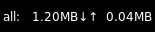
prefix='M'Configuration options
key
default
description
backgroundNoneWidget background color
fmt'{}'Format to apply to the string returned by the widget. Main purpose: applying markup. For a widget that returns
foo, usingfmt='<i>{}</i>'would give you<i>foo</i>. To control what the widget outputs in the first place, use theformatparamater of the widget (if it has one).font'sans'Default font
fontshadowNonefont shadow color, default is None(no shadow)
fontsizeNoneFont size. Calculated if None.
foreground'ffffff'Foreground colour
format'{interface}: {down:6.2f}{down_suffix:<2}↓↑{up:6.2f}{up_suffix:<2}'Display format of down/upload/total speed of given interfaces
interfaceNoneList of interfaces or single NIC as string to monitor, None to display all active NICs combined
markupTrueWhether or not to use pango markup
max_chars0Maximum number of characters to display in widget.
mouse_callbacks{}Dict of mouse button press callback functions. Accepts functions and
lazycalls.paddingNonePadding. Calculated if None.
prefixNoneUse a specific prefix for the unit of the speed.
scrollFalseWhether text should be scrolled. When True, you must set the widget's
width.scroll_clearFalseWhether text should scroll completely away (True) or stop when the end of the text is shown (False)
scroll_delay2Number of seconds to pause before starting scrolling and restarting/clearing text at end
scroll_fixed_widthFalseWhen
scroll=Truethewidthparameter is a maximum width and, when text is shorter than this, the widget will resize. Settingscroll_fixed_width=Truewill force the widget to have a fixed width, regardless of the size of the text.scroll_hideFalseWhether the widget should hide when scrolling has finished
scroll_interval0.1Time in seconds before next scrolling step
scroll_repeatTrueWhether text should restart scrolling once the text has ended
scroll_step1Number of pixels to scroll with each step
update_interval1The update interval.
use_bitsFalseUse bits instead of bytes per second?
Available commands
Click to view the available commands for
Net
NetGraph
- class libqtile.widget.NetGraph(*args, **kwargs)[source]
Display a network usage graph.
Widget requirements: psutil.
Supported bar orientations: horizontal only
example config 
default 
type='box'
type='line'
type='line', line_width=1
start_pos='top'Configuration options
key
default
description
backgroundNoneWidget background color
bandwidth_type'down'down(load)/up(load)
border_color'215578'Widget border color
border_width2Widget border width
fill_color'1667EB.3'Fill color for linefill graph
frequency1Update frequency in seconds
graph_color'18BAEB'Graph color
interface'auto'Interface to display info for ('auto' for detection)
line_width3Line width
margin_x3Margin X
margin_y3Margin Y
mouse_callbacks{}Dict of mouse button press callback functions. Accepts functions and
lazycalls.samples100Count of graph samples.
start_pos'bottom'Drawer starting position ('bottom'/'top')
type'linefill''box', 'line', 'linefill'
Available commands
Click to view the available commands for
NetGraph
Notify
- class libqtile.widget.Notify(*args, **kwargs)[source]
A notify widget
This widget can handle actions provided by notification clients. However, only the default action is supported, so if a client provides multiple actions then only the default (first) action can be invoked. Some programs will provide their own notification windows if the notification server does not support actions, so if you want your notifications to handle more than one action then specify
Falsefor theactionoption to disable all action handling. Unfortunately we cannot specify the capability for exactly one action.Supported bar orientations: horizontal and vertical
example config 
default Configuration options
key
default
description
actionTrueEnable handling of default action upon right click
audiofileNoneAudiofile played during notifications
backgroundNoneWidget background color
background_low'444444'Background low priority colour
background_urgent'440000'Background urgent priority colour
default_timeout10Default timeout (seconds) for normal notifications
default_timeout_low5Default timeout (seconds) for low urgency notifications.
default_timeout_urgentNoneDefault timeout (seconds) for urgent notifications
fmt'{}'Format to apply to the string returned by the widget. Main purpose: applying markup. For a widget that returns
foo, usingfmt='<i>{}</i>'would give you<i>foo</i>. To control what the widget outputs in the first place, use theformatparamater of the widget (if it has one).font'sans'Default font
fontshadowNonefont shadow color, default is None(no shadow)
fontsizeNoneFont size. Calculated if None.
foreground'ffffff'Foreground colour
foreground_low'dddddd'Foreground low priority colour
foreground_urgent'ff0000'Foreground urgent priority colour
markupTrueWhether or not to use pango markup
max_chars0Maximum number of characters to display in widget.
mouse_callbacks{}Dict of mouse button press callback functions. Accepts functions and
lazycalls.paddingNonePadding. Calculated if None.
parse_textNoneFunction to parse and modify notifications. e.g. function in config that removes line returns:def my_func(text) return text.replace('n', '')then set option parse_text=my_func
scrollFalseWhether text should be scrolled. When True, you must set the widget's
width.scroll_clearFalseWhether text should scroll completely away (True) or stop when the end of the text is shown (False)
scroll_delay2Number of seconds to pause before starting scrolling and restarting/clearing text at end
scroll_fixed_widthFalseWhen
scroll=Truethewidthparameter is a maximum width and, when text is shorter than this, the widget will resize. Settingscroll_fixed_width=Truewill force the widget to have a fixed width, regardless of the size of the text.scroll_hideFalseWhether the widget should hide when scrolling has finished
scroll_interval0.1Time in seconds before next scrolling step
scroll_repeatTrueWhether text should restart scrolling once the text has ended
scroll_step1Number of pixels to scroll with each step
Available commands
Click to view the available commands for
Notify
NvidiaSensors
- class libqtile.widget.NvidiaSensors(*args, **kwargs)[source]
Displays temperature, fan speed and performance level Nvidia GPU.
Supported bar orientations: horizontal and vertical
example config 
default 
threshold=60, foreground_alert='ff6000'Configuration options
key
default
description
backgroundNoneWidget background color
fmt'{}'Format to apply to the string returned by the widget. Main purpose: applying markup. For a widget that returns
foo, usingfmt='<i>{}</i>'would give you<i>foo</i>. To control what the widget outputs in the first place, use theformatparamater of the widget (if it has one).font'sans'Default font
fontshadowNonefont shadow color, default is None(no shadow)
fontsizeNoneFont size. Calculated if None.
foreground'ffffff'Foreground colour
foreground_alert'ff0000'Foreground colour alert
format'{temp}°C'Display string format. Three options available:
{temp}- temperature,{fan_speed}and{perf}- performance levelgpu_bus_id''GPU's Bus ID, ex:
01:00.0. If leave empty will display all available GPU'smarkupTrueWhether or not to use pango markup
max_chars0Maximum number of characters to display in widget.
mouse_callbacks{}Dict of mouse button press callback functions. Accepts functions and
lazycalls.paddingNonePadding. Calculated if None.
scrollFalseWhether text should be scrolled. When True, you must set the widget's
width.scroll_clearFalseWhether text should scroll completely away (True) or stop when the end of the text is shown (False)
scroll_delay2Number of seconds to pause before starting scrolling and restarting/clearing text at end
scroll_fixed_widthFalseWhen
scroll=Truethewidthparameter is a maximum width and, when text is shorter than this, the widget will resize. Settingscroll_fixed_width=Truewill force the widget to have a fixed width, regardless of the size of the text.scroll_hideFalseWhether the widget should hide when scrolling has finished
scroll_interval0.1Time in seconds before next scrolling step
scroll_repeatTrueWhether text should restart scrolling once the text has ended
scroll_step1Number of pixels to scroll with each step
threshold70If the current temperature value is above, then change to foreground_alert colour
update_interval2Update interval in seconds.
Available commands
Click to view the available commands for
NvidiaSensors
OpenWeather
- class libqtile.widget.OpenWeather(*args, **kwargs)[source]
A weather widget, data provided by the OpenWeather API.
- Some format options:
location_city
location_cityid
location_country
location_lat
location_long
weather
weather_details
units_temperature
units_wind_speed
isotime
humidity
pressure
sunrise
sunset
temp
visibility
wind_speed
wind_deg
wind_direction
main_feels_like
main_temp_min
main_temp_max
clouds_all
icon
Icon support is available but you will need a suitable font installed. A default icon mapping is provided (
OpenWeather.symbols) but changes can be made by settingweather_symbols. Available icon codes can be viewed here: https://openweathermap.org/weather-conditions#Icon-listSupported bar orientations: horizontal and vertical
example config 
location='London'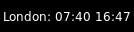
location='London', format='{location_city}: {sunrise} {sunset}'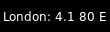
location='London', format='{location_city}: {wind_speed} {wind_deg} {wind_direction}'
location='London', format='{location_city}: {icon}'Configuration options
key
default
description
app_key'7834197c2338888258f8cb94ae14ef49'Open Weather access key. A default is provided, butn for prolonged use obtaining your own is suggested:n https://home.openweathermap.org/users/sign_up
backgroundNoneWidget background color
cityidNoneCity ID. Can be looked up on e.g.:n https://openweathermap.org/findn Takes precedence over location and coordinates.n Note that this is not equal to a WOEID.
coordinatesNoneDictionary containing latitude and longituden Example: coordinates={"longitude": "77.22",n "latitude": "28.67"}
dataNonePost Data
dateformat'%Y-%m-%d 'Format for dates, defaults to ISO.n For details see: https://docs.python.org/3/library/time.html#time.strftime
fmt'{}'Format to apply to the string returned by the widget. Main purpose: applying markup. For a widget that returns
foo, usingfmt='<i>{}</i>'would give you<i>foo</i>. To control what the widget outputs in the first place, use theformatparamater of the widget (if it has one).font'sans'Default font
fontshadowNonefont shadow color, default is None(no shadow)
fontsizeNoneFont size. Calculated if None.
foreground'ffffff'Foreground colour
format'{location_city}: {main_temp} °{units_temperature} {humidity}% {weather_details}'Display format
headers{}Extra Headers
jsonTrueIs Json?
language'en'Language of response. List of languages supported cann be seen at: https://openweathermap.org/current undern Multilingual support
locationNoneName of the city. Country name can be appendedn like cambridge,NZ. Takes precedence over zip-code.
markupTrueWhether or not to use pango markup
max_chars0Maximum number of characters to display in widget.
metricTrueTrue to use metric/C, False to use imperial/F
mouse_callbacks{}Dict of mouse button press callback functions. Accepts functions and
lazycalls.paddingNonePadding. Calculated if None.
parseNoneParse Function
scrollFalseWhether text should be scrolled. When True, you must set the widget's
width.scroll_clearFalseWhether text should scroll completely away (True) or stop when the end of the text is shown (False)
scroll_delay2Number of seconds to pause before starting scrolling and restarting/clearing text at end
scroll_fixed_widthFalseWhen
scroll=Truethewidthparameter is a maximum width and, when text is shorter than this, the widget will resize. Settingscroll_fixed_width=Truewill force the widget to have a fixed width, regardless of the size of the text.scroll_hideFalseWhether the widget should hide when scrolling has finished
scroll_interval0.1Time in seconds before next scrolling step
scroll_repeatTrueWhether text should restart scrolling once the text has ended
scroll_step1Number of pixels to scroll with each step
timeformat'%H:%M'Format for times, defaults to ISO.n For details see: https://docs.python.org/3/library/time.html#time.strftime
update_interval600Update interval in seconds, if none, the widget updates only once.
urlNoneUrl
user_agent'Qtile'Set the user agent
weather_symbols{}Dictionary of weather symbols. Can be used to override default symbols.
xmlFalseIs XML?
zipNoneZip code (USA) or "zip code,country code" forn other countries. E.g. 12345,NZ. Takes precedence overn coordinates.
Available commands
Click to view the available commands for
OpenWeather
Pomodoro
- class libqtile.widget.Pomodoro(*args, **kwargs)[source]
Pomodoro technique widget
Supported bar orientations: horizontal and vertical
example config 
default 
default 
default Configuration options
key
default
description
backgroundNoneWidget background color
color_active'00ff00'Colour then pomodoro is running
color_break'ffff00'Colour then it is break time
color_inactive'ff0000'Colour then pomodoro is inactive
fmt'{}'Format to apply to the string returned by the widget. Main purpose: applying markup. For a widget that returns
foo, usingfmt='<i>{}</i>'would give you<i>foo</i>. To control what the widget outputs in the first place, use theformatparamater of the widget (if it has one).font'sans'Default font
fontshadowNonefont shadow color, default is None(no shadow)
fontsizeNoneFont size. Calculated if None.
foreground'ffffff'Foreground colour
length_long_break15Length of a long break in minutes
length_pomodori25Length of one pomodori in minutes
length_short_break5Length of a short break in minutes
markupTrueWhether or not to use pango markup
max_chars0Maximum number of characters to display in widget.
mouse_callbacks{}Dict of mouse button press callback functions. Accepts functions and
lazycalls.notification_onTrueTurn notifications on
num_pomodori4Number of pomodori to do in a cycle
paddingNonePadding. Calculated if None.
prefix_active''Prefix then app is active
prefix_break'B 'Prefix during short break
prefix_inactive'POMODORO'Prefix when app is inactive
prefix_long_break'LB 'Prefix during long break
prefix_paused'PAUSE'Prefix during pause
scrollFalseWhether text should be scrolled. When True, you must set the widget's
width.scroll_clearFalseWhether text should scroll completely away (True) or stop when the end of the text is shown (False)
scroll_delay2Number of seconds to pause before starting scrolling and restarting/clearing text at end
scroll_fixed_widthFalseWhen
scroll=Truethewidthparameter is a maximum width and, when text is shorter than this, the widget will resize. Settingscroll_fixed_width=Truewill force the widget to have a fixed width, regardless of the size of the text.scroll_hideFalseWhether the widget should hide when scrolling has finished
scroll_interval0.1Time in seconds before next scrolling step
scroll_repeatTrueWhether text should restart scrolling once the text has ended
scroll_step1Number of pixels to scroll with each step
update_interval1Update interval in seconds, if none, the widget updates whenever the event loop is idle.
Available commands
Click to view the available commands for
Pomodoro
Prompt
- class libqtile.widget.Prompt(*args, **kwargs)[source]
A widget that prompts for user input
Input should be started using the
.start_input()method on this class.Supported bar orientations: horizontal and vertical
Configuration options
key
default
description
backgroundNoneWidget background color
bell_style'audible'Alert at the begin/end of the command history. Possible values: 'audible' (X11 only), 'visual' and None.
cursorTrueShow a cursor
cursor_color'bef098'Color for the cursor and text over it.
cursorblink0.5Cursor blink rate. 0 to disable.
fmt'{}'Format to apply to the string returned by the widget. Main purpose: applying markup. For a widget that returns
foo, usingfmt='<i>{}</i>'would give you<i>foo</i>. To control what the widget outputs in the first place, use theformatparamater of the widget (if it has one).font'sans'Default font
fontshadowNonefont shadow color, default is None(no shadow)
fontsizeNoneFont size. Calculated if None.
foreground'ffffff'Foreground colour
ignore_dups_historyFalseDon't store duplicates in history
markupTrueWhether or not to use pango markup
max_chars0Maximum number of characters to display in widget.
max_history100Commands to keep in history. 0 for no limit.
mouse_callbacks{}Dict of mouse button press callback functions. Accepts functions and
lazycalls.paddingNonePadding. Calculated if None.
prompt'{prompt}: 'Text displayed at the prompt
record_historyTrueKeep a record of executed commands
scrollFalseWhether text should be scrolled. When True, you must set the widget's
width.scroll_clearFalseWhether text should scroll completely away (True) or stop when the end of the text is shown (False)
scroll_delay2Number of seconds to pause before starting scrolling and restarting/clearing text at end
scroll_fixed_widthFalseWhen
scroll=Truethewidthparameter is a maximum width and, when text is shorter than this, the widget will resize. Settingscroll_fixed_width=Truewill force the widget to have a fixed width, regardless of the size of the text.scroll_hideFalseWhether the widget should hide when scrolling has finished
scroll_interval0.1Time in seconds before next scrolling step
scroll_repeatTrueWhether text should restart scrolling once the text has ended
scroll_step1Number of pixels to scroll with each step
visual_bell_color'ff0000'Color for the visual bell (changes prompt background).
visual_bell_time0.2Visual bell duration (in seconds).
Available commands
Click to view the available commands for
Prompt
PulseVolume
- class libqtile.widget.PulseVolume(*args, **kwargs)[source]
Volume widget for systems using PulseAudio.
The widget connects to the PulseAudio server by using the libpulse library and so should be updated virtually instantly rather than needing to poll the volume status regularly (NB this means that the
update_intervalparameter serves no purpose for this widget).The widget relies on the pulsectl_asyncio library to access the libpulse bindings. If you are using python 3.11 you must use
pulsectl_asyncio >= 1.0.0.Supported bar orientations: horizontal only
Configuration options
key
default
description
backgroundNoneWidget background color
cardidNoneCard Id
channel'Master'Channel
check_mute_commandNoneCommand to check mute status
check_mute_string'[off]'String expected from check_mute_command when volume is muted.When the output of the command matches this string, theaudio source is treated as muted.
device'default'Device Name
emojiFalseUse emoji to display volume states, only if
theme_pathis not set.The specified font needs to contain the correct unicode characters.emoji_list['🔇', '🔈', '🔉', '🔊']List of emojis/font-symbols to display volume states, only if
emojiis set. List contains 4 symbols, from lowest volume to highest.fmt'{}'Format to apply to the string returned by the widget. Main purpose: applying markup. For a widget that returns
foo, usingfmt='<i>{}</i>'would give you<i>foo</i>. To control what the widget outputs in the first place, use theformatparamater of the widget (if it has one).font'sans'Default font
fontshadowNonefont shadow color, default is None(no shadow)
fontsizeNoneFont size. Calculated if None.
foreground'ffffff'Foreground colour
get_volume_commandNoneCommand to get the current volume. The expected output should include 1-3 numbers and a
%sign.limit_max_volumeFalseLimit maximum volume to 100%
markupTrueWhether or not to use pango markup
max_chars0Maximum number of characters to display in widget.
mouse_callbacks{}Dict of mouse button press callback functions. Accepts functions and
lazycalls.mute_commandNoneMute command
padding3Padding left and right. Calculated if None.
scrollFalseWhether text should be scrolled. When True, you must set the widget's
width.scroll_clearFalseWhether text should scroll completely away (True) or stop when the end of the text is shown (False)
scroll_delay2Number of seconds to pause before starting scrolling and restarting/clearing text at end
scroll_fixed_widthFalseWhen
scroll=Truethewidthparameter is a maximum width and, when text is shorter than this, the widget will resize. Settingscroll_fixed_width=Truewill force the widget to have a fixed width, regardless of the size of the text.scroll_hideFalseWhether the widget should hide when scrolling has finished
scroll_interval0.1Time in seconds before next scrolling step
scroll_repeatTrueWhether text should restart scrolling once the text has ended
scroll_step1Number of pixels to scroll with each step
step2Volume change for up an down commands in percentage.Only used if
volume_up_commandandvolume_down_commandare not set.theme_pathNonePath of the icons
update_interval0.2Update time in seconds.
volume_appNoneApp to control volume
volume_down_commandNoneVolume down command
volume_up_commandNoneVolume up command
Available commands
Click to view the available commands for
PulseVolume
QuickExit
- class libqtile.widget.QuickExit(*args, **kwargs)[source]
A button to shut down Qtile. When clicked, a countdown starts. Clicking the button again stops the countdown and prevents Qtile from shutting down.
Supported bar orientations: horizontal and vertical
example config 
default 
default 
default_text='[X]', countdown_format='[{}]'
default_text='[X]', countdown_format='[{}]'Configuration options
key
default
description
backgroundNoneWidget background color
countdown_format'[ {} seconds ]'The text displayed when counting down.
countdown_start5The number to count down from.
default_text'[ shutdown ]'The text displayed on the button.
fmt'{}'Format to apply to the string returned by the widget. Main purpose: applying markup. For a widget that returns
foo, usingfmt='<i>{}</i>'would give you<i>foo</i>. To control what the widget outputs in the first place, use theformatparamater of the widget (if it has one).font'sans'Default font
fontshadowNonefont shadow color, default is None(no shadow)
fontsizeNoneFont size. Calculated if None.
foreground'ffffff'Foreground colour
markupTrueWhether or not to use pango markup
max_chars0Maximum number of characters to display in widget.
mouse_callbacks{}Dict of mouse button press callback functions. Accepts functions and
lazycalls.paddingNonePadding. Calculated if None.
scrollFalseWhether text should be scrolled. When True, you must set the widget's
width.scroll_clearFalseWhether text should scroll completely away (True) or stop when the end of the text is shown (False)
scroll_delay2Number of seconds to pause before starting scrolling and restarting/clearing text at end
scroll_fixed_widthFalseWhen
scroll=Truethewidthparameter is a maximum width and, when text is shorter than this, the widget will resize. Settingscroll_fixed_width=Truewill force the widget to have a fixed width, regardless of the size of the text.scroll_hideFalseWhether the widget should hide when scrolling has finished
scroll_interval0.1Time in seconds before next scrolling step
scroll_repeatTrueWhether text should restart scrolling once the text has ended
scroll_step1Number of pixels to scroll with each step
timer_interval1The countdown interval.
Available commands
Click to view the available commands for
QuickExit
ScreenSplit
- class libqtile.widget.ScreenSplit(*args, **kwargs)[source]
A simple widget to show the name of the current split and layout for the
ScreenSplitlayout.Supported bar orientations: horizontal and vertical
example config 
default Configuration options
key
default
description
backgroundNoneWidget background color
fmt'{}'Format to apply to the string returned by the widget. Main purpose: applying markup. For a widget that returns
foo, usingfmt='<i>{}</i>'would give you<i>foo</i>. To control what the widget outputs in the first place, use theformatparamater of the widget (if it has one).font'sans'Text font
fontshadowNonefont shadow color, default is None(no shadow)
fontsizeNoneFont pixel size. Calculated if None.
foreground'#ffffff'Foreground colour.
format'{split_name} ({layout})'Format string.
markupTrueWhether or not to use pango markup
max_chars0Maximum number of characters to display in widget.
mouse_callbacks{}Dict of mouse button press callback functions. Accepts functions and
lazycalls.paddingNonePadding left and right. Calculated if None.
scrollFalseWhether text should be scrolled. When True, you must set the widget's
width.scroll_clearFalseWhether text should scroll completely away (True) or stop when the end of the text is shown (False)
scroll_delay2Number of seconds to pause before starting scrolling and restarting/clearing text at end
scroll_fixed_widthFalseWhen
scroll=Truethewidthparameter is a maximum width and, when text is shorter than this, the widget will resize. Settingscroll_fixed_width=Truewill force the widget to have a fixed width, regardless of the size of the text.scroll_hideFalseWhether the widget should hide when scrolling has finished
scroll_interval0.1Time in seconds before next scrolling step
scroll_repeatTrueWhether text should restart scrolling once the text has ended
scroll_step1Number of pixels to scroll with each step
Available commands
Click to view the available commands for
ScreenSplit
Sep
- class libqtile.widget.Sep(*args, **kwargs)[source]
A visible widget separator
Supported bar orientations: horizontal and vertical
example config 
default 
padding=10, linewidth=5, size_percent=50Configuration options
key
default
description
backgroundNoneWidget background color
foreground'888888'Separator line colour.
linewidth1Width of separator line.
mouse_callbacks{}Dict of mouse button press callback functions. Accepts functions and
lazycalls.padding2Padding on either side of separator.
size_percent80Size as a percentage of bar size (0-100).
Available commands
Click to view the available commands for
Sep
She
- class libqtile.widget.She(*args, **kwargs)[source]
Widget to display the Super Hybrid Engine status
Can display either the mode or CPU speed on eeepc computers.
Supported bar orientations: horizontal and vertical
Configuration options
key
default
description
backgroundNoneWidget background color
device'/sys/devices/platform/eeepc/cpufv'sys path to cpufv
fmt'{}'Format to apply to the string returned by the widget. Main purpose: applying markup. For a widget that returns
foo, usingfmt='<i>{}</i>'would give you<i>foo</i>. To control what the widget outputs in the first place, use theformatparamater of the widget (if it has one).font'sans'Default font
fontshadowNonefont shadow color, default is None(no shadow)
fontsizeNoneFont size. Calculated if None.
foreground'ffffff'Foreground colour
format'speed'Type of info to display "speed" or "name"
markupTrueWhether or not to use pango markup
max_chars0Maximum number of characters to display in widget.
mouse_callbacks{}Dict of mouse button press callback functions. Accepts functions and
lazycalls.paddingNonePadding. Calculated if None.
scrollFalseWhether text should be scrolled. When True, you must set the widget's
width.scroll_clearFalseWhether text should scroll completely away (True) or stop when the end of the text is shown (False)
scroll_delay2Number of seconds to pause before starting scrolling and restarting/clearing text at end
scroll_fixed_widthFalseWhen
scroll=Truethewidthparameter is a maximum width and, when text is shorter than this, the widget will resize. Settingscroll_fixed_width=Truewill force the widget to have a fixed width, regardless of the size of the text.scroll_hideFalseWhether the widget should hide when scrolling has finished
scroll_interval0.1Time in seconds before next scrolling step
scroll_repeatTrueWhether text should restart scrolling once the text has ended
scroll_step1Number of pixels to scroll with each step
update_interval0.5Update Time in seconds.
Available commands
Click to view the available commands for
She
Spacer
- class libqtile.widget.Spacer(*args, **kwargs)[source]
Just an empty space on the bar
Often used with length equal to bar.STRETCH to push bar widgets to the right or bottom edge of the screen.
- Parameters:
- length
Length of the widget. Can be either
bar.STRETCHor a length in pixels.- width
DEPRECATED, same as
length.
Supported bar orientations: horizontal and vertical
example config 
default 
length=50Configuration options
key
default
description
backgroundNoneWidget background color
mouse_callbacks{}Dict of mouse button press callback functions. Accepts functions and
lazycalls.Available commands
Click to view the available commands for
Spacer
StatusNotifier
- class libqtile.widget.StatusNotifier(*args, **kwargs)[source]
A 'system tray' widget using the freedesktop StatusNotifierItem specification.
As per the specification, app icons are first retrieved from the user's current theme. If this is not available then the app may provide its own icon. In order to use this functionality, users are recommended to install the pyxdg module to support retrieving icons from the selected theme. If the icon specified by StatusNotifierItem can not be found in the user's current theme and no other icons are provided by the app, a fallback icon is used.
Left-clicking an icon will trigger an activate event.
Note
Context menus are not currently supported by the official widget. However, a modded version of the widget which provides basic menu support is available from elParaguayo's qtile-extras repo.
Supported bar orientations: horizontal and vertical
Configuration options
key
default
description
backgroundNoneWidget background color
icon_size16Icon width
icon_themeNoneName of theme to use for app icons
mouse_callbacks{}Dict of mouse button press callback functions. Accepts functions and
lazycalls.padding3Padding between icons
Available commands
Click to view the available commands for
StatusNotifier
StockTicker
- class libqtile.widget.StockTicker(*args, **kwargs)[source]
A stock ticker widget, based on the alphavantage API. Users must acquire an API key from https://www.alphavantage.co/support/#api-key
The widget defaults to the TIME_SERIES_INTRADAY API function (i.e. stock symbols), but arbitrary Alpha Vantage API queries can be made by passing extra arguments to the constructor.
# Display AMZN
widget.StockTicker(apikey=..., symbol="AMZN")

# Display BTC
widget.StockTicker(
    apikey=..., function="DIGITAL_CURRENCY_INTRADAY", symbol="BTC", market="USD"
)
Supported bar orientations: horizontal and vertical
example config 
symbol='QTIL'Configuration options
key
default
description
backgroundNoneWidget background color
dataNonePost Data
fmt'{}'Format to apply to the string returned by the widget. Main purpose: applying markup. For a widget that returns
foo, usingfmt='<i>{}</i>'would give you<i>foo</i>. To control what the widget outputs in the first place, use theformatparamater of the widget (if it has one).font'sans'Default font
fontshadowNonefont shadow color, default is None(no shadow)
fontsizeNoneFont size. Calculated if None.
foreground'ffffff'Foreground colour
func'TIME_SERIES_INTRADAY'The default API function to query
function'TIME_SERIES_INTRADAY'DEPRECATED: Use func.
headers{}Extra Headers
interval'1min'The default latency to query
jsonTrueIs Json?
markupTrueWhether or not to use pango markup
max_chars0Maximum number of characters to display in widget.
mouse_callbacks{}Dict of mouse button press callback functions. Accepts functions and
lazycalls.paddingNonePadding. Calculated if None.
parseNoneParse Function
scrollFalseWhether text should be scrolled. When True, you must set the widget's
width.scroll_clearFalseWhether text should scroll completely away (True) or stop when the end of the text is shown (False)
scroll_delay2Number of seconds to pause before starting scrolling and restarting/clearing text at end
scroll_fixed_widthFalseWhen
scroll=Truethewidthparameter is a maximum width and, when text is shorter than this, the widget will resize. Settingscroll_fixed_width=Truewill force the widget to have a fixed width, regardless of the size of the text.scroll_hideFalseWhether the widget should hide when scrolling has finished
scroll_interval0.1Time in seconds before next scrolling step
scroll_repeatTrueWhether text should restart scrolling once the text has ended
scroll_step1Number of pixels to scroll with each step
update_interval600Update interval in seconds, if none, the widget updates only once.
urlNoneUrl
user_agent'Qtile'Set the user agent
xmlFalseIs XML?
Available commands
Click to view the available commands for
StockTicker
SwapGraph
- class libqtile.widget.SwapGraph(*args, **kwargs)[source]
Display a swap info graph.
Widget requirements: psutil.
Supported bar orientations: horizontal only
example config 
default 
type='box'
type='line'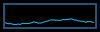
type='line', line_width=1
start_pos='top'Configuration options
key
default
description
backgroundNoneWidget background color
border_color'215578'Widget border color
border_width2Widget border width
fill_color'1667EB.3'Fill color for linefill graph
frequency1Update frequency in seconds
graph_color'18BAEB'Graph color
line_width3Line width
margin_x3Margin X
margin_y3Margin Y
mouse_callbacks{}Dict of mouse button press callback functions. Accepts functions and
lazycalls.samples100Count of graph samples.
start_pos'bottom'Drawer starting position ('bottom'/'top')
type'linefill''box', 'line', 'linefill'
Available commands
Click to view the available commands for
SwapGraph
Systray
- class libqtile.widget.Systray(*args, **kwargs)[source]
A widget that manages system tray.
Only one Systray widget is allowed. Adding additional Systray widgets will result in a ConfigError.
Note
Icons will not render correctly where the bar/widget is drawn with a semi-transparent background. Instead, icons will be drawn with a transparent background.
If using this widget it is therefore recommended to use a fully opaque background colour or a fully transparent one.
Supported bar orientations: horizontal and vertical
Only available on the following backends: x11
Configuration options
key
default
description
backgroundNoneWidget background color
icon_size20Icon width
mouse_callbacks{}Dict of mouse button press callback functions. Accepts functions and
lazycalls.padding5Padding between icons
Available commands
Click to view the available commands for
Systray
TaskList
- class libqtile.widget.TaskList(*args, **kwargs)[source]
Displays the icon and name of each window in the current group
Contrary to WindowTabs this is an interactive widget. The window that currently has focus is highlighted.
Optional requirements: pyxdg is needed to use theme icons and to display icons on Wayland.
Supported bar orientations: horizontal only
Configuration options
key
default
description
backgroundNoneWidget background color
border'215578'Border colour
borderwidth2Current group border width
font'sans'Default font
fontshadowNonefont shadow color, default is None(no shadow)
fontsizeNoneFont size. Calculated if None.
foreground'ffffff'Foreground colour
highlight_method'border'Method of highlighting (one of 'border' or 'block') Uses *_border color settings
icon_sizeNoneIcon size. (Calculated if set to None. Icons are hidden if set to 0.)
margin3Margin inside the box
margin_xNoneX Margin. Overrides 'margin' if set
margin_yNoneY Margin. Overrides 'margin' if set
markup_floatingNoneText markup of the floating window state. Supports pangomarkup with markup=True.e.g., "{}" or "<span underline="low">{}</span>"
markup_focusedNoneText markup of the focused window state. Supports pangomarkup with markup=True.e.g., "{}" or "<span underline="low">{}</span>"
markup_focused_floatingNoneText markup of the focused and floating window state. Supports pangomarkup with markup=True.e.g., "{}" or "<span underline="low">{}</span>"
markup_maximizedNoneText markup of the maximized window state. Supports pangomarkup with markup=True.e.g., "{}" or "<span underline="low">{}</span>"
markup_minimizedNoneText markup of the minimized window state. Supports pangomarkup with markup=True.e.g., "{}" or "<span underline="low">{}</span>"
markup_normalNoneText markup of the normal window state. Supports pangomarkup with markup=True.e.g., "{}" or "<span underline="low">{}</span>"
max_title_widthNoneMax size in pixels of task title.(if set to None, as much as available.)
mouse_callbacks{}Dict of mouse button press callback functions. Accepts functions and
lazycalls.padding3Padding inside the box
padding_xNoneX Padding. Overrides 'padding' if set
padding_yNoneY Padding. Overrides 'padding' if set
parse_textNoneFunction to parse and modify window names. e.g. function in config that removes excess strings from window name: def my_func(text) for string in [" - Chromium", " - Firefox"]: text = text.replace(string, "") return textthen set option parse_text=my_func
roundedTrueTo round or not to round borders
spacingNoneSpacing between tasks.(if set to None, will be equal to margin_x)
stretchTrueWidget fills available space in bar. Set to False to limit widget width to size of its contents.
theme_modeNoneWhen to use theme icons. None = never, preferred = use if available, fallback = use if app does not provide icon directly. preferred and fallback have identical behaviour on Wayland.
theme_pathNonePath to icon theme to be used by pyxdg for icons.
Nonewill use default icon theme.title_width_methodNoneMethod to compute the width of task title. (None, 'uniform'.)Defaults to None, the normal behaviour.
txt_floating'V 'Text representation of the floating window state. e.g., "V " or "🗗 "
txt_maximized'[] 'Text representation of the maximized window state. e.g., "[] " or "🗖 "
txt_minimized'_ 'Text representation of the minimized window state. e.g., "_ " or "🗕 "
unfocused_borderNoneBorder color for unfocused windows. Affects only hightlight_method 'border' and 'block'. Defaults to None, which means no special color.
urgent_alert_method'border'Method for alerting you of WM urgent hints (one of 'border' or 'text')
urgent_border'FF0000'Urgent border color
window_name_locationFalseWhether to show the location of the window in the title.
window_name_location_offset0The offset given to the window location
Available commands
Click to view the available commands for
TaskList
TextBox
- class libqtile.widget.TextBox(*args, **kwargs)[source]
A flexible textbox that can be updated from bound keys, scripts, and qshell.
Supported bar orientations: horizontal and vertical
example config 
default 
foreground='2980b9'Configuration options
key
default
description
backgroundNoneWidget background color
fmt'{}'Format to apply to the string returned by the widget. Main purpose: applying markup. For a widget that returns
foo, usingfmt='<i>{}</i>'would give you<i>foo</i>. To control what the widget outputs in the first place, use theformatparamater of the widget (if it has one).font'sans'Text font
fontshadowNonefont shadow color, default is None(no shadow)
fontsizeNoneFont pixel size. Calculated if None.
foreground'#ffffff'Foreground colour.
markupTrueWhether or not to use pango markup
max_chars0Maximum number of characters to display in widget.
mouse_callbacks{}Dict of mouse button press callback functions. Accepts functions and
lazycalls.paddingNonePadding left and right. Calculated if None.
scrollFalseWhether text should be scrolled. When True, you must set the widget's
width.scroll_clearFalseWhether text should scroll completely away (True) or stop when the end of the text is shown (False)
scroll_delay2Number of seconds to pause before starting scrolling and restarting/clearing text at end
scroll_fixed_widthFalseWhen
scroll=Truethewidthparameter is a maximum width and, when text is shorter than this, the widget will resize. Settingscroll_fixed_width=Truewill force the widget to have a fixed width, regardless of the size of the text.scroll_hideFalseWhether the widget should hide when scrolling has finished
scroll_interval0.1Time in seconds before next scrolling step
scroll_repeatTrueWhether text should restart scrolling once the text has ended
scroll_step1Number of pixels to scroll with each step
Available commands
Click to view the available commands for
TextBox
ThermalSensor
- class libqtile.widget.ThermalSensor(*args, **kwargs)[source]
Widget to display temperature sensor information
For using the thermal sensor widget you need to have lm-sensors installed. You can get a list of the tag_sensors executing "sensors" in your terminal. Then you can choose which you want, otherwise it will display the first available.
Widget requirements: psutil.
Supported bar orientations: horizontal and vertical
example config 
default 
tag_sensor='NVME'
format='{tag}: {temp:.0f}{unit}'
threshold=30.0Configuration options
key
default
description
backgroundNoneWidget background color
fmt'{}'Format to apply to the string returned by the widget. Main purpose: applying markup. For a widget that returns
foo, usingfmt='<i>{}</i>'would give you<i>foo</i>. To control what the widget outputs in the first place, use theformatparamater of the widget (if it has one).font'sans'Default font
fontshadowNonefont shadow color, default is None(no shadow)
fontsizeNoneFont size. Calculated if None.
foreground'ffffff'Foreground colour
foreground_alert'ff0000'Foreground colour alert
format'{temp:.1f}{unit}'Display string format. Three options available:
{temp}- temperature,{tag}- tag of the temperature sensor, and{unit}- °C or °FmarkupTrueWhether or not to use pango markup
max_chars0Maximum number of characters to display in widget.
metricTrueTrue to use metric/C, False to use imperial/F
mouse_callbacks{}Dict of mouse button press callback functions. Accepts functions and
lazycalls.paddingNonePadding. Calculated if None.
scrollFalseWhether text should be scrolled. When True, you must set the widget's
width.scroll_clearFalseWhether text should scroll completely away (True) or stop when the end of the text is shown (False)
scroll_delay2Number of seconds to pause before starting scrolling and restarting/clearing text at end
scroll_fixed_widthFalseWhen
scroll=Truethewidthparameter is a maximum width and, when text is shorter than this, the widget will resize. Settingscroll_fixed_width=Truewill force the widget to have a fixed width, regardless of the size of the text.scroll_hideFalseWhether the widget should hide when scrolling has finished
scroll_interval0.1Time in seconds before next scrolling step
scroll_repeatTrueWhether text should restart scrolling once the text has ended
scroll_step1Number of pixels to scroll with each step
tag_sensorNoneTag of the temperature sensor. For example: "temp1" or "Core 0"
threshold70If the current temperature value is above, then change to foreground_alert colour
update_interval2Update interval in seconds
Available commands
Click to view the available commands for
ThermalSensor
ThermalZone
- class libqtile.widget.ThermalZone(*args, **kwargs)[source]
Thermal zone widget.
This widget was made to read thermal zone files and transform values to human readable format. You can set zone parameter to any standard thermal zone file from /sys/class/thermal directory.
Supported bar orientations: horizontal only
example config 
default 
high=45
high=40, crit=45Configuration options
key
default
description
backgroundNoneWidget background color
crit70Critical temperature level
fgcolor_crit'ff0000'Font color on critical values
fgcolor_high'ffaa00'Font color on high values
fgcolor_normal'ffffff'Font color on normal values
fmt'{}'Format to apply to the string returned by the widget. Main purpose: applying markup. For a widget that returns
foo, usingfmt='<i>{}</i>'would give you<i>foo</i>. To control what the widget outputs in the first place, use theformatparamater of the widget (if it has one).font'sans'Default font
fontshadowNonefont shadow color, default is None(no shadow)
fontsizeNoneFont size. Calculated if None.
foreground'ffffff'Foreground colour
format'{temp}°C'Display format
format_crit'{temp}°C CRIT!'Critical display format
hiddenFalseSet True to only show if critical value reached
high50High themperature level
markupTrueWhether or not to use pango markup
max_chars0Maximum number of characters to display in widget.
mouse_callbacks{}Dict of mouse button press callback functions. Accepts functions and
lazycalls.paddingNonePadding. Calculated if None.
scrollFalseWhether text should be scrolled. When True, you must set the widget's
width.scroll_clearFalseWhether text should scroll completely away (True) or stop when the end of the text is shown (False)
scroll_delay2Number of seconds to pause before starting scrolling and restarting/clearing text at end
scroll_fixed_widthFalseWhen
scroll=Truethewidthparameter is a maximum width and, when text is shorter than this, the widget will resize. Settingscroll_fixed_width=Truewill force the widget to have a fixed width, regardless of the size of the text.scroll_hideFalseWhether the widget should hide when scrolling has finished
scroll_interval0.1Time in seconds before next scrolling step
scroll_repeatTrueWhether text should restart scrolling once the text has ended
scroll_step1Number of pixels to scroll with each step
update_interval2.0Update interval
zone'/sys/class/thermal/thermal_zone0/temp'Thermal zone
Available commands
Click to view the available commands for
ThermalZone
Volume
- class libqtile.widget.Volume(*args, **kwargs)[source]
Widget that display and change volume
By default, this widget uses
amixerto get and set the volume so users will need to make sure this is installed. Alternatively, users may set the relevant parameters for the widget to use a different application.If theme_path is set it draw widget as icons.
Supported bar orientations: horizontal only
example config 
theme_path='/home/docs/checkouts/readthedocs.org/user_builds/qtile/checkouts/latest/test/data/ss_temp'
emoji=True
fmt='Vol: {}'Configuration options
key
default
description
backgroundNoneWidget background color
cardidNoneCard Id
channel'Master'Channel
check_mute_commandNoneCommand to check mute status
check_mute_string'[off]'String expected from check_mute_command when volume is muted.When the output of the command matches this string, theaudio source is treated as muted.
device'default'Device Name
emojiFalseUse emoji to display volume states, only if
theme_pathis not set.The specified font needs to contain the correct unicode characters.emoji_list['🔇', '🔈', '🔉', '🔊']List of emojis/font-symbols to display volume states, only if
emojiis set. List contains 4 symbols, from lowest volume to highest.fmt'{}'Format to apply to the string returned by the widget. Main purpose: applying markup. For a widget that returns
foo, usingfmt='<i>{}</i>'would give you<i>foo</i>. To control what the widget outputs in the first place, use theformatparamater of the widget (if it has one).font'sans'Default font
fontshadowNonefont shadow color, default is None(no shadow)
fontsizeNoneFont size. Calculated if None.
foreground'ffffff'Foreground colour
get_volume_commandNoneCommand to get the current volume. The expected output should include 1-3 numbers and a
%sign.markupTrueWhether or not to use pango markup
max_chars0Maximum number of characters to display in widget.
mouse_callbacks{}Dict of mouse button press callback functions. Accepts functions and
lazycalls.mute_commandNoneMute command
padding3Padding left and right. Calculated if None.
scrollFalseWhether text should be scrolled. When True, you must set the widget's
width.scroll_clearFalseWhether text should scroll completely away (True) or stop when the end of the text is shown (False)
scroll_delay2Number of seconds to pause before starting scrolling and restarting/clearing text at end
scroll_fixed_widthFalseWhen
scroll=Truethewidthparameter is a maximum width and, when text is shorter than this, the widget will resize. Settingscroll_fixed_width=Truewill force the widget to have a fixed width, regardless of the size of the text.scroll_hideFalseWhether the widget should hide when scrolling has finished
scroll_interval0.1Time in seconds before next scrolling step
scroll_repeatTrueWhether text should restart scrolling once the text has ended
scroll_step1Number of pixels to scroll with each step
step2Volume change for up an down commands in percentage.Only used if
volume_up_commandandvolume_down_commandare not set.theme_pathNonePath of the icons
update_interval0.2Update time in seconds.
volume_appNoneApp to control volume
volume_down_commandNoneVolume down command
volume_up_commandNoneVolume up command
Available commands
Click to view the available commands for
Volume
Wallpaper
- class libqtile.widget.Wallpaper(*args, **kwargs)[source]
Supported bar orientations: horizontal and vertical
Configuration options
key
default
description
backgroundNoneWidget background color
directory'~/Pictures/wallpapers/'Wallpaper Directory
fmt'{}'Format to apply to the string returned by the widget. Main purpose: applying markup. For a widget that returns
foo, usingfmt='<i>{}</i>'would give you<i>foo</i>. To control what the widget outputs in the first place, use theformatparamater of the widget (if it has one).font'sans'Default font
fontshadowNonefont shadow color, default is None(no shadow)
fontsizeNoneFont size. Calculated if None.
foreground'ffffff'Foreground colour
labelNoneUse a fixed label instead of image name.
markupTrueWhether or not to use pango markup
max_chars0Maximum number of characters to display in widget.
mouse_callbacks{}Dict of mouse button press callback functions. Accepts functions and
lazycalls.option'fill'How to fit the wallpaper when wallpaper_command isNone. None, 'fill' or 'stretch'.
paddingNonePadding. Calculated if None.
random_selectionFalseIf set, use random initial wallpaper and randomly cycle through the wallpapers.
scrollFalseWhether text should be scrolled. When True, you must set the widget's
width.scroll_clearFalseWhether text should scroll completely away (True) or stop when the end of the text is shown (False)
scroll_delay2Number of seconds to pause before starting scrolling and restarting/clearing text at end
scroll_fixed_widthFalseWhen
scroll=Truethewidthparameter is a maximum width and, when text is shorter than this, the widget will resize. Settingscroll_fixed_width=Truewill force the widget to have a fixed width, regardless of the size of the text.scroll_hideFalseWhether the widget should hide when scrolling has finished
scroll_interval0.1Time in seconds before next scrolling step
scroll_repeatTrueWhether text should restart scrolling once the text has ended
scroll_step1Number of pixels to scroll with each step
wallpaperNoneWallpaper
wallpaper_command['feh', '--bg-fill']Wallpaper command. If None, thewallpaper will be painted without the use of a helper.
Available commands
Click to view the available commands for
Wallpaper
WidgetBox
- class libqtile.widget.WidgetBox(*args, **kwargs)[source]
A widget to declutter your bar.
WidgetBox is a widget that hides widgets by default but shows them when the box is opened.
Widgets that are hidden will still update etc. as if they were on the main bar.
Button clicks are passed to widgets when they are visible so callbacks will work.
Widgets in the box also remain accessible via command interfaces.
Widgets can only be added to the box via the configuration file. The widget is configured by adding widgets to the "widgets" parameter as follows:
widget.WidgetBox(widgets=[
    widget.TextBox(text="This widget is in the box"),
    widget.Memory()
    ]
),
Supported bar orientations: horizontal only
example config 
widgets=[] 
widgets=[] Configuration options
key
default
description
backgroundNoneWidget background color
close_button_location'left'Location of close button when box open ('left' or 'right')
fmt'{}'Format to apply to the string returned by the widget. Main purpose: applying markup. For a widget that returns
foo, usingfmt='<i>{}</i>'would give you<i>foo</i>. To control what the widget outputs in the first place, use theformatparamater of the widget (if it has one).font'sans'Default font
fontshadowNonefont shadow color, default is None(no shadow)
fontsizeNoneFont size. Calculated if None.
foreground'ffffff'Foreground colour
markupTrueWhether or not to use pango markup
max_chars0Maximum number of characters to display in widget.
mouse_callbacks{}Dict of mouse button press callback functions. Accepts functions and
lazycalls.paddingNonePadding. Calculated if None.
scrollFalseWhether text should be scrolled. When True, you must set the widget's
width.scroll_clearFalseWhether text should scroll completely away (True) or stop when the end of the text is shown (False)
scroll_delay2Number of seconds to pause before starting scrolling and restarting/clearing text at end
scroll_fixed_widthFalseWhen
scroll=Truethewidthparameter is a maximum width and, when text is shorter than this, the widget will resize. Settingscroll_fixed_width=Truewill force the widget to have a fixed width, regardless of the size of the text.scroll_hideFalseWhether the widget should hide when scrolling has finished
scroll_interval0.1Time in seconds before next scrolling step
scroll_repeatTrueWhether text should restart scrolling once the text has ended
scroll_step1Number of pixels to scroll with each step
start_openedFalseSpawn the box opened
text_closed'[<]'Text when box is closed
text_open'[>]'Text when box is open
widgets[]A list of widgets to include in the box
Available commands
Click to view the available commands for
WidgetBox
WindowCount
- class libqtile.widget.WindowCount(*args, **kwargs)[source]
A simple widget to display the number of windows in the current group of the screen on which the widget is.
Supported bar orientations: horizontal and vertical
example config 
default Configuration options
key
default
description
backgroundNoneWidget background color
fmt'{}'Format to apply to the string returned by the widget. Main purpose: applying markup. For a widget that returns
foo, usingfmt='<i>{}</i>'would give you<i>foo</i>. To control what the widget outputs in the first place, use theformatparamater of the widget (if it has one).font'sans'Text font
fontshadowNonefont shadow color, default is None(no shadow)
fontsizeNoneFont pixel size. Calculated if None.
foreground'#ffffff'Foreground colour.
markupTrueWhether or not to use pango markup
max_chars0Maximum number of characters to display in widget.
mouse_callbacks{}Dict of mouse button press callback functions. Accepts functions and
lazycalls.paddingNonePadding left and right. Calculated if None.
scrollFalseWhether text should be scrolled. When True, you must set the widget's
width.scroll_clearFalseWhether text should scroll completely away (True) or stop when the end of the text is shown (False)
scroll_delay2Number of seconds to pause before starting scrolling and restarting/clearing text at end
scroll_fixed_widthFalseWhen
scroll=Truethewidthparameter is a maximum width and, when text is shorter than this, the widget will resize. Settingscroll_fixed_width=Truewill force the widget to have a fixed width, regardless of the size of the text.scroll_hideFalseWhether the widget should hide when scrolling has finished
scroll_interval0.1Time in seconds before next scrolling step
scroll_repeatTrueWhether text should restart scrolling once the text has ended
scroll_step1Number of pixels to scroll with each step
show_zeroFalseShow window count when no windows
text_format'{num}'Format for message
Available commands
Click to view the available commands for
WindowCount
WindowName
- class libqtile.widget.WindowName(*args, **kwargs)[source]
Displays the name of the window that currently has focus
Supported bar orientations: horizontal and vertical
example config 
default 
default 
default 
default Configuration options
key
default
description
backgroundNoneWidget background color
empty_group_string' 'string to display when no windows are focused on current group
fmt'{}'Format to apply to the string returned by the widget. Main purpose: applying markup. For a widget that returns
foo, usingfmt='<i>{}</i>'would give you<i>foo</i>. To control what the widget outputs in the first place, use theformatparamater of the widget (if it has one).font'sans'Default font
fontshadowNonefont shadow color, default is None(no shadow)
fontsizeNoneFont size. Calculated if None.
for_current_screenFalseinstead of this bars screen use currently active screen
foreground'ffffff'Foreground colour
format'{state}{name}'format of the text
markupTrueWhether or not to use pango markup
max_chars0Maximum number of characters to display in widget.
mouse_callbacks{}Dict of mouse button press callback functions. Accepts functions and
lazycalls.paddingNonePadding. Calculated if None.
parse_textNoneFunction to parse and modify window names. e.g. function in config that removes excess strings from window name: def my_func(text) for string in [" - Chromium", " - Firefox"]: text = text.replace(string, "") return textthen set option parse_text=my_func
scrollFalseWhether text should be scrolled. When True, you must set the widget's
width.scroll_clearFalseWhether text should scroll completely away (True) or stop when the end of the text is shown (False)
scroll_delay2Number of seconds to pause before starting scrolling and restarting/clearing text at end
scroll_fixed_widthFalseWhen
scroll=Truethewidthparameter is a maximum width and, when text is shorter than this, the widget will resize. Settingscroll_fixed_width=Truewill force the widget to have a fixed width, regardless of the size of the text.scroll_hideFalseWhether the widget should hide when scrolling has finished
scroll_interval0.1Time in seconds before next scrolling step
scroll_repeatTrueWhether text should restart scrolling once the text has ended
scroll_step1Number of pixels to scroll with each step
Available commands
Click to view the available commands for
WindowName
WindowTabs
- class libqtile.widget.WindowTabs(*args, **kwargs)[source]
Displays the name of each window in the current group. Contrary to TaskList this is not an interactive widget. The window that currently has focus is highlighted.
Supported bar orientations: horizontal and vertical
example config 
default Configuration options
key
default
description
backgroundNoneWidget background color
fmt'{}'Format to apply to the string returned by the widget. Main purpose: applying markup. For a widget that returns
foo, usingfmt='<i>{}</i>'would give you<i>foo</i>. To control what the widget outputs in the first place, use theformatparamater of the widget (if it has one).font'sans'Default font
fontshadowNonefont shadow color, default is None(no shadow)
fontsizeNoneFont size. Calculated if None.
foreground'ffffff'Foreground colour
markupTrueWhether or not to use pango markup
max_chars0Maximum number of characters to display in widget.
mouse_callbacks{}Dict of mouse button press callback functions. Accepts functions and
lazycalls.paddingNonePadding. Calculated if None.
parse_text<function WindowTabs.<lambda> at 0x7fa5f8050790>Function to modify window names. It must accept a string argument (original window name) and return a string with the modified name.
scrollFalseWhether text should be scrolled. When True, you must set the widget's
width.scroll_clearFalseWhether text should scroll completely away (True) or stop when the end of the text is shown (False)
scroll_delay2Number of seconds to pause before starting scrolling and restarting/clearing text at end
scroll_fixed_widthFalseWhen
scroll=Truethewidthparameter is a maximum width and, when text is shorter than this, the widget will resize. Settingscroll_fixed_width=Truewill force the widget to have a fixed width, regardless of the size of the text.scroll_hideFalseWhether the widget should hide when scrolling has finished
scroll_interval0.1Time in seconds before next scrolling step
scroll_repeatTrueWhether text should restart scrolling once the text has ended
scroll_step1Number of pixels to scroll with each step
selected('<b>', '</b>')Selected task indicator
separator' | 'Task separator text.
Available commands
Click to view the available commands for
WindowTabs
Wlan
- class libqtile.widget.Wlan(*args, **kwargs)[source]
Displays Wifi SSID and quality.
Widget requirements: iwlib.
Supported bar orientations: horizontal only
example config 
default 
format='{essid} {percent:2.0%}'Configuration options
key
default
description
backgroundNoneWidget background color
disconnected_message'Disconnected'String to show when the wlan is diconnected.
ethernet_interface'eth0'The ethernet interface to monitor, NOTE: If you do not have a wlan device in your system, ethernet functionality will not work, use the Net widget instead
ethernet_message'eth'String to show when ethernet is being used
fmt'{}'Format to apply to the string returned by the widget. Main purpose: applying markup. For a widget that returns
foo, usingfmt='<i>{}</i>'would give you<i>foo</i>. To control what the widget outputs in the first place, use theformatparamater of the widget (if it has one).font'sans'Default font
fontshadowNonefont shadow color, default is None(no shadow)
fontsizeNoneFont size. Calculated if None.
foreground'ffffff'Foreground colour
format'{essid} {quality}/70'Display format. For percents you can use "{essid} {percent:2.0%}"
interface'wlan0'The interface to monitor
markupTrueWhether or not to use pango markup
max_chars0Maximum number of characters to display in widget.
mouse_callbacks{}Dict of mouse button press callback functions. Accepts functions and
lazycalls.paddingNonePadding. Calculated if None.
scrollFalseWhether text should be scrolled. When True, you must set the widget's
width.scroll_clearFalseWhether text should scroll completely away (True) or stop when the end of the text is shown (False)
scroll_delay2Number of seconds to pause before starting scrolling and restarting/clearing text at end
scroll_fixed_widthFalseWhen
scroll=Truethewidthparameter is a maximum width and, when text is shorter than this, the widget will resize. Settingscroll_fixed_width=Truewill force the widget to have a fixed width, regardless of the size of the text.scroll_hideFalseWhether the widget should hide when scrolling has finished
scroll_interval0.1Time in seconds before next scrolling step
scroll_repeatTrueWhether text should restart scrolling once the text has ended
scroll_step1Number of pixels to scroll with each step
update_interval1The update interval.
use_ethernetFalseActivate or deactivate checking for ethernet when no wlan connection is detected
Available commands
Click to view the available commands for
Wlan
Wttr
- class libqtile.widget.Wttr(*args, **kwargs)[source]
Display weather widget provided by wttr.in.
To specify your own custom output format, use the special %-notation (example: 'My_city: %t(%f), wind: %w'):
%c Weather condition,
%C Weather condition textual name,
%h Humidity,
%t Temperature (Actual),
%f Temperature (Feels Like),
%w Wind,
%l Location,
%m Moonphase 🌑🌒🌓🌔🌕🌖🌗🌘,
%M Moonday,
%p precipitation (mm),
%P pressure (hPa),
%D Dawn !,
%S Sunrise !,
%z Zenith !,
%s Sunset !,
%d Dusk !. (!times are shown in the local timezone)
Add the character
~at the beginning to get weather for some special location:~Vostok Stationor~Eiffel Tower.Also can use IP-addresses (direct) or domain names (prefixed with @) to specify a location:
@github.com,123.456.678.123Specify multiple locations as dictionary
location={
    'Minsk': 'Minsk',
    '64.127146,-21.873472': 'Reykjavik',
}
Cities will change randomly every update.
Supported bar orientations: horizontal and vertical
example config 
location={'London': 'Home'}Configuration options
key
default
description
backgroundNoneWidget background color
dataNonePost Data
fmt'{}'Format to apply to the string returned by the widget. Main purpose: applying markup. For a widget that returns
foo, usingfmt='<i>{}</i>'would give you<i>foo</i>. To control what the widget outputs in the first place, use theformatparamater of the widget (if it has one).font'sans'Default font
fontshadowNonefont shadow color, default is None(no shadow)
fontsizeNoneFont size. Calculated if None.
foreground'ffffff'Foreground colour
format'3'Display text format. Choose presets in range 1-4 (Ex.
"1") or build your own custom output format, use the special %-notation. See https://github.com/chubin/wttr.in#one-line-outputheaders{}Extra Headers
jsonFalseIs Json?
lang'en'Display text language. List of supported languages https://wttr.in/:translation
location{}Dictionary. Key is a city or place name, or GPS coordinates. Value is a display name. If the dictionary is empty, the location will be determined based on your IP address.
markupTrueWhether or not to use pango markup
max_chars0Maximum number of characters to display in widget.
mouse_callbacks{}Dict of mouse button press callback functions. Accepts functions and
lazycalls.paddingNonePadding. Calculated if None.
parseNoneParse Function
scrollFalseWhether text should be scrolled. When True, you must set the widget's
width.scroll_clearFalseWhether text should scroll completely away (True) or stop when the end of the text is shown (False)
scroll_delay2Number of seconds to pause before starting scrolling and restarting/clearing text at end
scroll_fixed_widthFalseWhen
scroll=Truethewidthparameter is a maximum width and, when text is shorter than this, the widget will resize. Settingscroll_fixed_width=Truewill force the widget to have a fixed width, regardless of the size of the text.scroll_hideFalseWhether the widget should hide when scrolling has finished
scroll_interval0.1Time in seconds before next scrolling step
scroll_repeatTrueWhether text should restart scrolling once the text has ended
scroll_step1Number of pixels to scroll with each step
units'm''m'- metric,'M'- show wind speed in m/s,'u'- United States unitsupdate_interval600Update interval in seconds. Recommendation: if you want to display multiple locations alternately, maybe set a smaller interval, ex.
30.urlNoneUrl
user_agent'Qtile'Set the user agent
xmlFalseIs XML?
Available commands
Click to view the available commands for
Wttr